A Community discussion forum for Halo Custom Edition, Halo 2 Vista, Portal and Halo Machinima
|
| »Forums Index »Halo Custom Edition (Bungie/Gearbox) »Halo CE General Discussion »www.halomaps.org | 
|
| Page 2 of 3 | Go to page: · 1 · [2] · 3 · Prev · Next |
| Author | Topic: www.halomaps.org (71 messages, Page 2 of 3) | ||||
| Moderators: Dennis | |||||
|
Dennis  Joined: Jan 27, 2005 
"We are made of starstuff.� ― Carl Sagan |
Posted: Nov 29, 2012 01:49 PM
Msg. 36 of 71
Quote: --- Original message by: hobbet360 The Google widget will be included like on this forum and Halo Custom Edition Site.The option could be like the select language? |
||||
|
|
|||||
|
HaloExtreme117 Joined: May 5, 2012 
~Gone~ |
Posted: Nov 30, 2012 10:51 AM
Msg. 37 of 71
Quote: --- Original message by: FX0042 Can you make the site more like Microsoft's site? http://img507.imageshack.us/img507/8714/windowssitescreenshot2.jpg When someone suggests to imitate a Microsoft design, they are crazy. |
||||
|
|
|||||
|
SilentJacket Joined: Jun 9, 2012 
-Did I miss something?- |
Posted: Nov 30, 2012 10:57 AM
Msg. 38 of 71
I actually like the simple interface
in any case, I think this forum does need a graphical overhaul, at least to make it more clean, and with more modernized icons (retina display support plox?) |
||||
|
|
|||||
|
ptowery Joined: Aug 28, 2007 
oify |
Posted: Nov 30, 2012 11:31 AM
Msg. 39 of 71
Quote: --- Original message by: haloextreme117 Quote: --- Original message by: FX0042 Can you make the site more like Microsoft's site? http://img507.imageshack.us/img507/8714/windowssitescreenshot2.jpg When someone suggests to imitate a Microsoft design, they are crazy. please stop. |
||||
|
|
|||||
|
Jaz Joined: Mar 21, 2010 
[Insert sarcastic comment here] |
Posted: Nov 30, 2012 11:38 AM
Msg. 40 of 71
Quote: --- Original message by: haloextreme117 Quote: --- Original message by: FX0042 Can you make the site more like Microsoft's site? http://img507.imageshack.us/img507/8714/windowssitescreenshot2.jpg When someone suggests to imitate a Microsoft design, they are crazy. You mean the design of Windows, Microsoft Office, NotePad, WordPad, Halo, Fable, and various other applications and operating systems? Yeah, because you'd be crazy to want to imitate the most successful designs ever produced... And on the topic of Metro-style designs, there is nothing wrong with the style. I personally think the simple design is brilliant. No more pixelised attempts at adding a glow to everything possible or over-sharp gradients. Simple colours. It looks amazing. And yeah, screenshots make it look bad, but looks cool really if you use applications that replicate the Metro style well. The Start Screen is a good example of the Metro Style if you actually see it in practice. :P I think Halomaps would certainly benefit from the style. Would modernise the site. |
||||
|
|
|||||
|
OHunterO Joined: May 24, 2012 
. |
Posted: Nov 30, 2012 11:44 AM
Msg. 41 of 71
Quote: --- Original message by: FX0042 Can you make the site more like Microsoft's site? http://img507.imageshack.us/img507/8714/windowssitescreenshot2.jpg You might want to close your porn next time, you have youjizz open... :/ |
||||
|
|
|||||
|
SilentJacket Joined: Jun 9, 2012
-Did I miss something?- |
Posted: Nov 30, 2012 11:51 AM
Msg. 42 of 71
o.o
wat. OT: I think that a great scheme would be a minimalistic, but sleek design with smooth animations for icons and tabs |
||||
|
|
|||||
|
altis94 Joined: Oct 5, 2012 
Join my Discord https://discord.gg/GDVEaRD |
Posted: Nov 30, 2012 02:00 PM
Msg. 43 of 71
porn tube too... kids these days.
|
||||
|
|
|||||
|
Slayer117 Joined: Oct 3, 2008 
Host of CE3 2010-forever! |
Posted: Dec 1, 2012 12:10 AM
Msg. 44 of 71
Keep the light.
If you change it to dark I will murder a Mudkip. |
||||
|
|
|||||
|
OpsY Joined: Feb 19, 2007 
Frobisher Bay |
Posted: Dec 1, 2012 12:42 PM
Msg. 45 of 71
I like the current interface, it's been there for so long. Perhaps it could use some refresh and new top banners but I don't see a need for a total reconstructing
|
||||
|
|
|||||
|
game user10 Joined: Dec 9, 2011 
Who is the Overseer? |
Posted: Dec 2, 2012 02:26 AM
Msg. 46 of 71
How about fixing the go to page thing? I click last page and it takes me to a page that doesn't even exist. Example: I click last page of a five-page thread, takes me to seventh page.
|
||||
|
|
|||||
|
Dennis Joined: Jan 27, 2005
"We are made of starstuff.� ― Carl Sagan |
Posted: Dec 2, 2012 01:48 PM
Msg. 47 of 71
Quote: --- Original message by: game user10 There is only one page on the website in question.How about fixing the go to page thing? I click last page and it takes me to a page that doesn't even exist. Example: I click last page of a five-page thread, takes me to seventh page. |
||||
|
|
|||||
|
DEEhunter Joined: Dec 16, 2006 
|
Posted: Dec 2, 2012 02:47 PM
Msg. 48 of 71
More metro.
|
||||
|
|
|||||
|
MoooseGuy Joined: Aug 10, 2008 
I Approve This Message. |
Posted: Dec 2, 2012 03:17 PM
Msg. 49 of 71
Metro is the ugliest style for an interface I have ever seen. Bland color squares mixed in with image-applied squares. Messy, clunky, and built for high schoolers.
|
||||
|
|
|||||
|
HaloExtreme117 Joined: May 5, 2012
~Gone~ |
Posted: Dec 2, 2012 03:19 PM
Msg. 50 of 71
Quote: --- Original message by: MoooseGuy Metro is the ugliest style for an interface I have ever seen. Bland color squares mixed in with image-applied squares. Messy, clunky, and built for high schoolers. I totally agree, it's such a stupid design. |
||||
|
|
|||||
|
Jaz Joined: Mar 21, 2010
[Insert sarcastic comment here] |
Posted: Dec 2, 2012 05:51 PM
Msg. 51 of 71
Quote: --- Original message by: MoooseGuy Metro is the ugliest style for an interface I have ever seen. Bland color squares mixed in with image-applied squares. Messy, clunky, and built for high schoolers. Have you seen it in practice? Screenies make it look horrible. But it looks brilliant here on my monitor. It is certainly not bland, and it is most definitely not messy nor clunky. (Well, might be messy if you don't bother organising it, but the same applies to the desktop environment) It's clean, it's bright, it's colourful, and it's built for uh.... people who don't still use Windows 2000? |
||||
|
|
|||||
|
Higuy Joined: Mar 6, 2007 
@lucasgovatos |
Posted: Dec 2, 2012 06:05 PM
Msg. 52 of 71
Quote: --- Original message by: Jaz Quote: --- Original message by: MoooseGuy Metro is the ugliest style for an interface I have ever seen. Bland color squares mixed in with image-applied squares. Messy, clunky, and built for high schoolers. Have you seen it in practice? Screenies make it look horrible. But it looks brilliant here on my monitor. It is certainly not bland, and it is most definitely not messy nor clunky. (Well, might be messy if you don't bother organising it, but the same applies to the desktop environment) It's clean, it's bright, it's colourful, and it's built for uh.... people who don't still use Windows 2000? I've used it on the regular version and also for windows server. It's literally one of the stupidest designs that mc could of gone for, especially for developers. It's very hard to work with and it's obvious it's made for tablets and touch screens. Maybe on a touch screen it would be nice, but other than that, I personally dislike it. |
||||
|
|
|||||
|
SilentJacket Joined: Jun 9, 2012
-Did I miss something?- |
Posted: Dec 2, 2012 06:34 PM
Msg. 53 of 71
style, not button layout
|
||||
|
|
|||||
|
Corvette19 Joined: Feb 27, 2007 
|
Posted: Dec 2, 2012 11:23 PM
Msg. 54 of 71
Quote: --- Original message by: ptowery halomods and gearbox forums are dark, Halomaps was always light. I like it light, but it could do with a more haloish color scheme I think. Halomods was originally dark! They made it light later! I think the light is nice and easy on the eyes. I love the layout here and the colors. |
||||
|
|
|||||
|
Jesse Joined: Jan 18, 2009 Discord: Holy Crust#4500 |
Posted: Dec 2, 2012 11:46 PM
Msg. 55 of 71
Quote: --- Original message by: Corvette19 Quote: --- Original message by: ptowery halomods and gearbox forums are dark, Halomaps was always light. I like it light, but it could do with a more haloish color scheme I think. Halomods was originally dark! They made it light later! I think the light is nice and easy on the eyes. I love the layout here and the colors. Isn't that pretty much what he said? |
||||
|
|
|||||
|
Dennis Joined: Jan 27, 2005
"We are made of starstuff.� ― Carl Sagan |
Posted: Dec 3, 2012 01:59 AM
Msg. 56 of 71
There seems to be some confusion even after I tried to clarify it for some. So....
To put this in context Click this link - this the page that us being redesigned - nothing else at the moment. |
||||
|
|
|||||
|
Dennis Joined: Jan 27, 2005
"We are made of starstuff.� ― Carl Sagan |
Posted: Dec 27, 2012 09:01 PM
Msg. 57 of 71
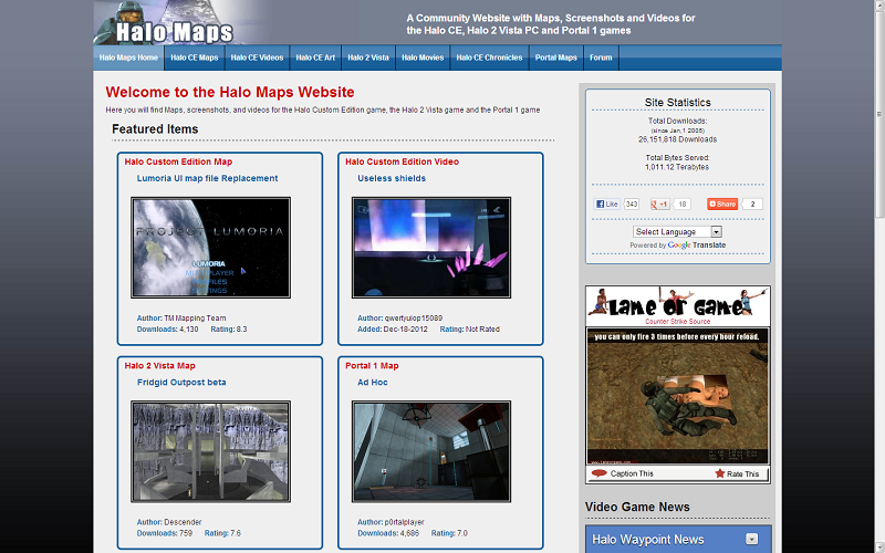
Well... After playing with dark for a while I finally I decided on a light theme. The newly redesigned site is now active with a number of changes including larger preview images, longer new addition lists, an updated twitter feed and a Video game news feed that allows you to select Halo Waypoint News, Halo Bungie.org, IGN Video Games, 1Up PC Game News and Giantbomb Game Reviews news feeds.
 |
||||
|
|
|||||
|
Pepzee Joined: Sep 9, 2010 
Retired Halo Modder |
Posted: Dec 27, 2012 09:45 PM
Msg. 58 of 71
Awesome, I like the new design.
The Minecraft Maps link at the top doesn't work though. |
||||
|
|
|||||
|
Dennis Joined: Jan 27, 2005
"We are made of starstuff.� ― Carl Sagan |
Posted: Dec 27, 2012 09:57 PM
Msg. 59 of 71
Quote: --- Original message by: Pepzee Awesome, I like the new design. The Minecraft Maps link at the top doesn't work though. Yeaaa... I knew I forgot something.... it is not yet ready. And although you didn't ask: Yes that is over 26 million downloads and over 1 thousand Terabytes (that's over 1 million gigabytes) of data. |
||||
|
|
|||||
|
HaloExtreme117 Joined: May 5, 2012
~Gone~ |
Posted: Dec 28, 2012 05:17 PM
Msg. 60 of 71
 Looks better without the ads. |
||||
|
|
|||||
|
Jaz Joined: Mar 21, 2010
[Insert sarcastic comment here] |
Posted: Dec 28, 2012 05:40 PM
Msg. 61 of 71
It really does look better without ads.
 Why don't you just get adblock, HaloExtreme? :/ |
||||
|
|
|||||
|
HaloExtreme117 Joined: May 5, 2012
~Gone~ |
Posted: Dec 28, 2012 05:45 PM
Msg. 62 of 71
I prefer my little adblock app.
|
||||
|
|
|||||
|
SilentJacket Joined: Jun 9, 2012
-Did I miss something?- |
Posted: Dec 28, 2012 05:48 PM
Msg. 63 of 71
Quote: --- Original message by: HaloExtreme117 http://i.imgur.com/VCXnB.png Looks better without the ads. bro, you need to check your mail also, I prefer to keep ads up, they pay for this site. |
||||
|
|
|||||
|
Dennis Joined: Jan 27, 2005
"We are made of starstuff.� ― Carl Sagan |
Posted: Dec 28, 2012 05:57 PM
Msg. 64 of 71
Quote: --- Original message by: Jaz I would prefer to not have ads on the site however as I pointed out in another post you guys have consumed over 1 million gigabytes of data. (1,010 terabytes) and downloaded over 26 million files all on my dime.It really does look better without ads. http://i1185.photobucket.com/albums/z355/Garagorn/Halomapsno-ads_zps2535420c.png Why don't you just get adblock, HaloExtreme? :/ |
||||
|
|
|||||
|
Jaz Joined: Mar 21, 2010
[Insert sarcastic comment here] |
Posted: Dec 28, 2012 06:01 PM
Msg. 65 of 71
Yeah, on my PC, I have adblock disabled on halomaps. Using a laptop atm though. :/
|
||||
|
|
|||||
|
SilentJacket Joined: Jun 9, 2012
-Did I miss something?- |
Posted: Dec 28, 2012 06:18 PM
Msg. 66 of 71
Quote: --- Original message by: SilentJacket Quote: --- Original message by: HaloExtreme117 http://i.imgur.com/VCXnB.png Looks better without the ads. bro, you need to check your mail also, I prefer to keep ads up, they pay for this site. |
||||
|
|
|||||
|
Mushi Joined: Jul 21, 2007 
Halo's Ring is just, Awesome. |
Posted: Dec 29, 2012 12:17 AM
Msg. 67 of 71
Im gonna miss the old Site looks, but hey it's almost 2013 now things gotta change.
|
||||
|
|
|||||
|
subtank Joined: Mar 19, 2008 
Down is Up |
Posted: Dec 30, 2012 07:46 AM
Msg. 68 of 71
Would it be possible to have a drop-down menu instead of static links on the navigation?
|
||||
|
|
|||||
|
Bottletopman Joined: Feb 5, 2011 
Blessed are the cheesemakers |
Posted: Dec 30, 2012 08:27 AM
Msg. 69 of 71
I'd prefer dark, because it's far easier on the eyes, especially when you're in a dark environment - It's like looking at a light bulb.
But, to appeal to both sides, maybe implement a background colour inverter? Switch between light and dark? |
||||
|
|
|||||
|
Scott Joined: Apr 4, 2005 
No. |
Posted: Dec 30, 2012 12:07 PM
Msg. 70 of 71
I think a theme switcher would be the way to go, but then I also favor a complete redesign of the site.
Expand your software into a better board, then put it up for free (ad-enabled) and make a couple bucks off people looking for iPB/vB/Xen alternatives. |
||||
|
|
|||||
| Page 2 of 3 | Go to page: · 1 · [2] · 3 · Prev · Next |

|