A Community discussion forum for Halo Custom Edition, Halo 2 Vista, Portal and Halo Machinima
|
| »Forums Index »Halo Custom Edition (Bungie/Gearbox) »Halo CE General Discussion »Nova Mapping Team - We Are Recruiting! | 
|
| Page 4 of 5 | Go to page: · 1 · 2 · 3 · [4] · 5 · Prev · Next |
| Author | Topic: Nova Mapping Team - We Are Recruiting! (161 messages, Page 4 of 5) | ||||
| Moderators: Dennis | |||||
|
Dumb AI Joined: Sep 18, 2011 
Dead. |
Posted: Feb 22, 2013 11:48 PM
Msg. 106 of 161
In a sort of a bad way.
Believe it or not, you guys are excellent motivators. inb4 I get too far with my new design,here it is  No color yet. Still waiting for master noob. Edited by Dumb AI on Feb 22, 2013 at 11:52 PM |
||||
|
|
|||||
|
master noob Joined: Aug 10, 2012 
343Industries Advocate |
Posted: Feb 23, 2013 12:11 AM
Msg. 107 of 161
the shield bar and health bar would look better separate, but that's more opinion.
in the nice little L shape you made for the grenades and ammo, you can have the ammo number in the main box shape and in the lower hanging part you could insert the maximum number of rounds in a clip, and the whole top part could be moved up a little more. |
||||
|
|
|||||
|
MatthewDratt Joined: Sep 11, 2010 
TAKEDOWN IS OUT MattDratt.com |
Posted: Feb 23, 2013 12:17 AM
Msg. 108 of 161
Although I do like the new 'overall' design of the HUD/Shield here is what I think it should be more like (using your current design)
 -Removed those bars -Shrank the amount of space the health has. It just looks way to big compared to shield |
||||
|
|
|||||
|
Guilty_spark Joined: Dec 8, 2011 
enjoy my bright, blue, balls! |
Posted: Feb 23, 2013 12:27 AM
Msg. 109 of 161
Quote: --- Original message by: MatthewDratt people were complaining cause there was no bars in the first place.Although I do like the new 'overall' design of the HUD/Shield here is what I think it should be more like (using your current design) https://dl.dropbox.com/u/6240433/myhud.jpg -Removed those bars -Shrank the amount of space the health has. It just looks way to big compared to shield |
||||
|
|
|||||
|
MatthewDratt Joined: Sep 11, 2010
TAKEDOWN IS OUT MattDratt.com |
Posted: Feb 23, 2013 12:38 AM
Msg. 110 of 161
Quote: --- Original message by: Spark Quote: --- Original message by: MatthewDratt people were complaining cause there was no bars in the first place.Although I do like the new 'overall' design of the HUD/Shield here is what I think it should be more like (using your current design) https://dl.dropbox.com/u/6240433/myhud.jpg -Removed those bars -Shrank the amount of space the health has. It just looks way to big compared to shield Not my personal taste. If there is going to be bars I'd suggest adding more then. Like split the bar into 8 parts |
||||
|
|
|||||
|
Guilty_spark Joined: Dec 8, 2011
enjoy my bright, blue, balls! |
Posted: Feb 23, 2013 01:43 AM
Msg. 111 of 161
Thank you dennis for getting rid of the trolls.I was also thinking 6 to 8 bars for the health bar.
|
||||
|
|
|||||
|
Dumb AI Joined: Sep 18, 2011
Dead. |
Posted: Feb 23, 2013 01:47 AM
Msg. 112 of 161
I say 7.
|
||||
|
|
|||||
|
Guilty_spark Joined: Dec 8, 2011
enjoy my bright, blue, balls! |
Posted: Feb 23, 2013 01:52 AM
Msg. 113 of 161
I say 1000
|
||||
|
|
|||||
|
Dumb AI Joined: Sep 18, 2011
Dead. |
Posted: Feb 23, 2013 01:57 AM
Msg. 114 of 161
That's too hard to draw
Edited by Dumb AI on Feb 23, 2013 at 01:58 AM |
||||
|
|
|||||
|
Hobbet360 Joined: Jan 10, 2012 
ProTools > ToolPro |
Posted: Feb 23, 2013 01:58 AM
Msg. 115 of 161
Quote: --- Original message by: Dumb AI I say 7. Yep, my lucky number. Because my favourite number is a tad mush, 21. |
||||
|
|
|||||
|
Spartan314 Joined: Aug 21, 2010 
Former biped rigger & FP animator |
Posted: Feb 23, 2013 01:59 AM
Msg. 116 of 161
7 is a nice number.
|
||||
|
|
|||||
|
Hobbet360 Joined: Jan 10, 2012
ProTools > ToolPro |
Posted: Feb 23, 2013 02:02 AM
Msg. 117 of 161
I have a random idea, you know how you have the Dumb_AI logo in the corner... Well you could have the circle face as the radar... Just for kicks. :D
|
||||
|
|
|||||
|
The Lodeman Joined: Sep 16, 2012 
Hipster Lodeman: Enjoyed goats before it was cool. |
Posted: Feb 23, 2013 03:40 AM
Msg. 118 of 161
It's a good simple little HUD. Perhaps experiment with rounding off some of the edgs to make it blend more softly.
It looks a bit sharp at the moment, in my expert opinion. |
||||
|
|
|||||
|
Skidrow925 Joined: Mar 19, 2010 
"ideological sense of respect and tact of a 5yo" |
Posted: Feb 23, 2013 11:30 AM
Msg. 119 of 161
I would think that rounding them off would kind of remove the whole design ideal...
Maybe you should have like 117 segments? Heh. For the amount of segments, it would look better to use a nice round number like, 8, 16, 32, etc. I think it looks fine, however, without any separated segments, and just one solid bar that actually does split but doesn't have those stupid lines. As for as an ammo counter, being able to glance and see how many bullets you have is helpful. Even just a segmented "progress bar" without visible splits like the CMT had could be useful. |
||||
|
|
|||||
|
Dumb AI Joined: Sep 18, 2011
Dead. |
Posted: Feb 23, 2013 04:27 PM
Msg. 120 of 161
It's hard to explain but the health works just like the health bar in Dead Space.
|
||||
|
|
|||||
|
Dumb AI Joined: Sep 18, 2011
Dead. |
Posted: Feb 23, 2013 09:19 PM
Msg. 121 of 161
Not that way!
To be brief, the health decreases like the health bar does in Dead Space. The segments are only for looks. It has no effect on how it decreases. The health bar's alpha is one smooth gradient. Update:Grenade icons  Edited by Dumb AI on Feb 23, 2013 at 09:20 PM |
||||
|
|
|||||
|
SilentJacket Joined: Jun 9, 2012 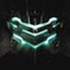
-Did I miss something?- |
Posted: Feb 23, 2013 10:04 PM
Msg. 122 of 161
I gusta that
|
||||
|
|
|||||
|
Spartan314 Joined: Aug 21, 2010
Former biped rigger & FP animator |
Posted: Feb 23, 2013 10:06 PM
Msg. 123 of 161
Not trying to be picky and all, but I think it would look better if you curved the lines on the frag grenade. Looks a little simplistic.
Just a little aesthetic thing. |
||||
|
|
|||||
|
Dumb AI Joined: Sep 18, 2011
Dead. |
Posted: Feb 23, 2013 10:06 PM
Msg. 124 of 161
Thank you...?
|
||||
|
|
|||||
|
Guilty_spark Joined: Dec 8, 2011
enjoy my bright, blue, balls! |
Posted: Feb 24, 2013 03:24 PM
Msg. 125 of 161
I would go with what spartan314 said.
|
||||
|
|
|||||
|
bourrin33 Joined: Oct 19, 2009 
HEK not installed tho |
Posted: Feb 24, 2013 04:18 PM
Msg. 126 of 161
it would be the h1 shield bar shape, just sayin
|
||||
|
|
|||||
|
Dumb AI Joined: Sep 18, 2011
Dead. |
Posted: Feb 24, 2013 04:39 PM
Msg. 127 of 161
What are you trying to say?
O_o "It would be" implies that it will be the shape of the H1 shield bar,some time in the future. But it already is! |
||||
|
|
|||||
|
Sceny Joined: Nov 20, 2010 
Awesome Faggot! |
Posted: Feb 25, 2013 08:54 PM
Msg. 128 of 161
Dumb AI, got xfire?
|
||||
|
|
|||||
|
Guilty_spark Joined: Dec 8, 2011
enjoy my bright, blue, balls! |
Posted: Feb 25, 2013 08:58 PM
Msg. 129 of 161
almost all my team members do everyone but vergil does dumb ai's xfire is simonthekiller1024
|
||||
|
|
|||||
|
Dumb AI Joined: Sep 18, 2011
Dead. |
Posted: Feb 25, 2013 08:59 PM
Msg. 130 of 161
Yes.
simonthekiller1024 |
||||
|
|
|||||
|
Guilty_spark Joined: Dec 8, 2011
enjoy my bright, blue, balls! |
Posted: Feb 25, 2013 09:02 PM
Msg. 131 of 161
and if you wanna add me its spark364
|
||||
|
|
|||||
|
Hobbet360 Joined: Jan 10, 2012
ProTools > ToolPro |
Posted: Feb 26, 2013 12:18 AM
Msg. 132 of 161
Oo, oo!
And mine is Hobbet360 =) |
||||
|
|
|||||
|
Spartan Tom Joined: Oct 23, 2011 
Inactive |
Posted: Feb 26, 2013 02:34 AM
Msg. 133 of 161
Mine is theelitepro1337
|
||||
|
|
|||||
|
Guilty_spark Joined: Dec 8, 2011
enjoy my bright, blue, balls! |
Posted: Feb 26, 2013 03:01 PM
Msg. 134 of 161
^ umm yes we are I have said before i'm still looking for someone good at modeling bipeds and someone good with particles.
|
||||
|
|
|||||
|
Dumb AI Joined: Sep 18, 2011
Dead. |
Posted: Mar 2, 2013 10:53 PM
Msg. 135 of 161
 Good colors? If you think you have a better combination, tell me! |
||||
|
|
|||||
|
MatthewDratt Joined: Sep 11, 2010
TAKEDOWN IS OUT MattDratt.com |
Posted: Mar 2, 2013 11:03 PM
Msg. 136 of 161
I still think the health part of the health/shield is too big
|
||||
|
|
|||||
|
Dumb AI Joined: Sep 18, 2011
Dead. |
Posted: Mar 2, 2013 11:06 PM
Msg. 137 of 161
It's about importance.
I think that health is usually considered less important than shields (they are equally important). |
||||
|
|
|||||
|
SilentJacket Joined: Jun 9, 2012
-Did I miss something?- |
Posted: Mar 2, 2013 11:12 PM
Msg. 138 of 161
can you integrate your grenade icons into a single tab?
|
||||
|
|
|||||
|
MatthewDratt Joined: Sep 11, 2010
TAKEDOWN IS OUT MattDratt.com |
Posted: Mar 2, 2013 11:17 PM
Msg. 139 of 161
Quote: --- Original message by: SilentJacket can you integrate your grenade icons into a single tab? I think he's just showing them both off and they will be Quote: --- Original message by: Dumb AI It's about importance. I think that health is usually considered less important than shields (they are equally important). Exactly my point. Health is less important and shouldn't appear equal or larger than the sheild |
||||
|
|
|||||
|
Dumb AI Joined: Sep 18, 2011
Dead. |
Posted: Mar 2, 2013 11:23 PM
Msg. 140 of 161
Yeah...I'm not gonna argue that one out.
This forum has enough already. |
||||
|
|
|||||
| Page 4 of 5 | Go to page: · 1 · 2 · 3 · [4] · 5 · Prev · Next |

|