A Community discussion forum for Halo Custom Edition, Halo 2 Vista, Portal and Halo Machinima
|
| »Forums Index »Halo Custom Edition (Bungie/Gearbox) »Halo CE General Discussion »Nova Mapping Team - We Are Recruiting! | 
|
| Page 3 of 5 | Go to page: · 1 · 2 · [3] · 4 · 5 · Prev · Next |
| Author | Topic: Nova Mapping Team - We Are Recruiting! (161 messages, Page 3 of 5) | ||||
| Moderators: Dennis | |||||
|
Dumb AI Joined: Sep 18, 2011 
Dead. |
Posted: Feb 13, 2013 10:24 AM
Msg. 71 of 161
You can have 20,if you want to.
I'm just saying,I could give it a shot too. |
||||
|
|
|||||
|
Guilty_spark Joined: Dec 8, 2011 
enjoy my bright, blue, balls! |
Posted: Feb 15, 2013 04:21 PM
Msg. 72 of 161
several more things to ask is there anyone good with particles that would wanna join?I also found out that mootjuh doesn't really model bipeds so is there anyone else that would be willing to help or join? I am hoping to have something big to show off in ce3.
Edited by Spark on Feb 15, 2013 at 04:24 PM |
||||
|
|
|||||
|
Guilty_spark Joined: Dec 8, 2011
enjoy my bright, blue, balls! |
Posted: Feb 21, 2013 04:00 PM
Msg. 73 of 161
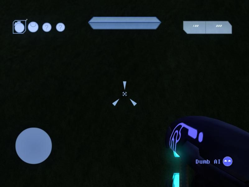
I will just leave this here
 |
||||
|
|
|||||
|
master noob Joined: Aug 10, 2012 
343Industries Advocate |
Posted: Feb 21, 2013 04:03 PM
Msg. 74 of 161
all of the HUD elements are way too large, too close to the center, and the health & shield bars are indistinguishable.
|
||||
|
|
|||||
|
Guilty_spark Joined: Dec 8, 2011
enjoy my bright, blue, balls! |
Posted: Feb 21, 2013 04:05 PM
Msg. 75 of 161
like in all halo games health bar is on bottom and I will say I do agree that the grenade hud element is a little large.
 Edited by Spark on Feb 21, 2013 at 04:14 PM |
||||
|
|
|||||
|
XlzQwerty1 Joined: Aug 6, 2009 
|
Posted: Feb 21, 2013 04:27 PM
Msg. 76 of 161
Looks bad :(
|
||||
|
|
|||||
|
Higuy Joined: Mar 6, 2007 
@lucasgovatos |
Posted: Feb 21, 2013 04:29 PM
Msg. 77 of 161
Quote: --- Original message by: Dumb AI Quote: --- Original message by: Vergil So basically "screw you thats no excuse your designs are junk"? Well,I am just sayin' this: You don't have to be older than 14 to make a good design. (Not saying that your designs are bad) Agreed. I started when I was 12, and learned a lot and even made a couple decent maps by the time I was 14. |
||||
|
|
|||||
|
Guilty_spark Joined: Dec 8, 2011
enjoy my bright, blue, balls! |
Posted: Feb 21, 2013 04:32 PM
Msg. 78 of 161
Quote: --- Original message by: XlzQwerty1 Looks bad :( rather than just saying it looks bad maybe you could give suggestions on what you think needs changed.(after all that's why I posted the pics in the first place) Edited by Spark on Feb 21, 2013 at 04:33 PM |
||||
|
|
|||||
|
XlzQwerty1 Joined: Aug 6, 2009
|
Posted: Feb 21, 2013 05:00 PM
Msg. 79 of 161
Honestly I'd start everything again from scratch except for the crosshair, that looks good. The design is indeed simple, which is good, however, the colour is too opaque and blocks the majority of the screen. I'd suggest using a bit more gradient too.
|
||||
|
|
|||||
|
Skidrow925 Joined: Mar 19, 2010 
"ideological sense of respect and tact of a 5yo" |
Posted: Feb 21, 2013 05:12 PM
Msg. 80 of 161
I would say the design is fairly good, but could use some labeling of some kind. Also, as was said, transparency and gradients are needed in here.
Also, bashing by age doesn't really do anything. Age isn't really a factor in most creative processes. I know people that created some pretty epic stuff around 8-10 years, and I know people that have spent pretty much their entire lives with an extreme lack of creativity. This entire argument however, is beside the point. Just sayin. |
||||
|
|
|||||
|
Guilty_spark Joined: Dec 8, 2011
enjoy my bright, blue, balls! |
Posted: Feb 21, 2013 05:22 PM
Msg. 81 of 161
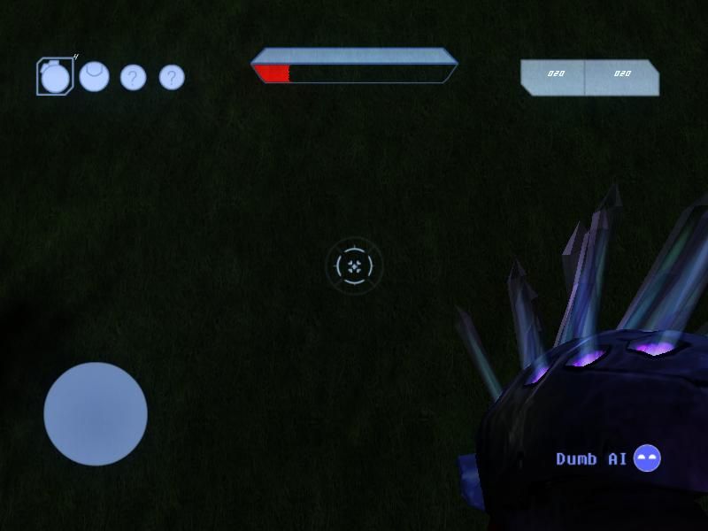
Quote: --- Original message by: Killer5000 strange I believe you are grey knight as to why?well you are 13 same age as grey knight,also grey knight showed me that same pic on xfire and its the same link as well.so either your grey knight or you are taking credit for his work or he is taking credit for your work (not sure which yet).i made http://img32.imageshack.us/img32/7591/sapiendualcore201302211.jpg and im only 13 |
||||
|
|
|||||
|
Guilty_spark Joined: Dec 8, 2011
enjoy my bright, blue, balls! |
Posted: Feb 21, 2013 05:34 PM
Msg. 82 of 161
And now that you pm'ed me the truth im gonna post it.you mean odstnik masterz1336 well the picture was in his status i just took it from there :) really taking credit for something you didn't do?people like you make me sick
Edited by Spark on Feb 21, 2013 at 05:37 PM Edited by Spark on Feb 21, 2013 at 05:40 PM |
||||
|
|
|||||
|
Guilty_spark Joined: Dec 8, 2011
enjoy my bright, blue, balls! |
Posted: Feb 21, 2013 05:57 PM
Msg. 83 of 161
Quote: --- Original message by: Killer5000 k you get started on that let me know how it goes.i will get somekind of revenge GRRR |
||||
|
|
|||||
|
Dumb AI Joined: Sep 18, 2011
Dead. |
Posted: Feb 21, 2013 07:23 PM
Msg. 84 of 161
Quote: --- Original message by: XlzQwerty1 Honestly I'd start everything again from scratch except for the crosshair, that looks good. The design is indeed simple, which is good, however, the colour is too opaque and blocks the majority of the screen. I'd suggest using a bit more gradient too. And yet no one complains about the mess of lines that the Halo 4 HUD has. Those lines cover up more space than my less-than-satisfactory work. My HUD is a bit oversized,yes,but it doesn't take up half the screen (for it to be the majority,it should be at least greater than half) Labeling is unnecessary.I haven't really seen a single HUD with any sort of labeling. Every element should be able to be identified with ease (sadly,it didn't seem to work like it should) Edited by Dumb AI on Feb 21, 2013 at 07:52 PM |
||||
|
|
|||||
|
Hobbet360 Joined: Jan 10, 2012 
ProTools > ToolPro |
Posted: Feb 22, 2013 07:28 AM
Msg. 85 of 161
I can only think of one/two thing to improve the HUD, I think it is a tad linear and the radar is a bit bland. I can't do better, I'm just suggesting.
Oh look I'm first to post on page 4. :D Edited by hobbet360 on Feb 22, 2013 at 07:29 AM |
||||
|
|
|||||
|
Dumb AI Joined: Sep 18, 2011
Dead. |
Posted: Feb 22, 2013 09:43 PM
Msg. 86 of 161
 inb4 you complain,give me a basic list of what needs improvement. Edited by Dumb AI on Feb 22, 2013 at 09:46 PM |
||||
|
|
|||||
|
SilentJacket Joined: Jun 9, 2012 
-Did I miss something?- |
Posted: Feb 22, 2013 09:47 PM
Msg. 87 of 161
the whole thing is too blocky
it looks more like an MS paint overlay, than an integrated hud Sorry if this sounds biting, but I advise you start over, and look at HUD icons in past Halos, and other games |
||||
|
|
|||||
|
XlzQwerty1 Joined: Aug 6, 2009
|
Posted: Feb 22, 2013 09:49 PM
Msg. 88 of 161
Looks pretty cool, I'd suggest inverting the gradient on the ammo counter and grenades though (I'd think it look better with light on top rather than dark on top of gradient).
Any way you can make the shield and health meter more distinct from each other, like making the health meter smaller or a different design? I think you can redo the grenades though, they seem... a bit cartoonish Edited by XlzQwerty1 on Feb 22, 2013 at 09:49 PM |
||||
|
|
|||||
|
Dumb AI Joined: Sep 18, 2011
Dead. |
Posted: Feb 22, 2013 09:50 PM
Msg. 89 of 161
Quote: --- Original message by: SilentJacket the whole thing is too blocky it looks more like an MS paint overlay, than an integrated hud Sorry if this sounds biting, but I advise you start over, and look at HUD icons in past Halos, and other games Before you complain about that,go complain about the Halo 2 HUD. That's where I got much of the designs from. See that ammo counter? Direct trace of the Halo 2 ammo counter. You should really start complaining about the Halo 2 and 3 HUD's being too blocky as well. Edited by Dumb AI on Feb 22, 2013 at 09:52 PM |
||||
|
|
|||||
|
Guilty_spark Joined: Dec 8, 2011
enjoy my bright, blue, balls! |
Posted: Feb 22, 2013 09:52 PM
Msg. 90 of 161
get the hell off my thread you troll.
|
||||
|
|
|||||
|
SilentJacket Joined: Jun 9, 2012
-Did I miss something?- |
Posted: Feb 22, 2013 09:52 PM
Msg. 91 of 161
Quote: --- Original message by: Dumb AI Quote: --- Original message by: SilentJacket the whole thing is too blocky it looks more like an MS paint overlay, than an integrated hud Sorry if this sounds biting, but I advise you start over, and look at HUD icons in past Halos, and other games Before you complain about that,go complain about the Halo 2 HUD. That's where I got much of the designs from. your point being...? My thoughts still stand that your HUD right now is blocky, and intrusive a good HUD should aid in battlefield awareness, yours is just distracting... |
||||
|
|
|||||
|
Dumb AI Joined: Sep 18, 2011
Dead. |
Posted: Feb 22, 2013 09:55 PM
Msg. 92 of 161
Quote: --- Original message by: SilentJacket Quote: --- Original message by: Dumb AI Quote: --- Original message by: SilentJacket the whole thing is too blocky it looks more like an MS paint overlay, than an integrated hud Sorry if this sounds biting, but I advise you start over, and look at HUD icons in past Halos, and other games Before you complain about that,go complain about the Halo 2 HUD. That's where I got much of the designs from. your point being...? My thoughts still stand that your HUD right now is blocky, and intrusive a good HUD should aid in battlefield awareness, yours is just distracting... Oh,and Bungie's isn't? You go ahead and sketch out something better then. Because I have absolutely no idea how I could improve it anymore. |
||||
|
|
|||||
|
SilentJacket Joined: Jun 9, 2012
-Did I miss something?- |
Posted: Feb 22, 2013 09:57 PM
Msg. 93 of 161
ok, Ill make something by tomorrow, though I doubt you would implement it
E: why are you hiding behind bungie? their HUD in H2 was almost as bad, if not as huge as the ones you have EE: I'm not trying to shoot you down, but you are being awfully defensive... Edited by SilentJacket on Feb 22, 2013 at 10:00 PM |
||||
|
|
|||||
|
Guilty_spark Joined: Dec 8, 2011
enjoy my bright, blue, balls! |
Posted: Feb 22, 2013 09:59 PM
Msg. 94 of 161
the hud is really not that bad when you are actually playing.
|
||||
|
|
|||||
|
Dumb AI Joined: Sep 18, 2011
Dead. |
Posted: Feb 22, 2013 10:01 PM
Msg. 95 of 161
I am willing to implement whatever it is you'll make.
Edited by Dumb AI on Feb 22, 2013 at 10:02 PM |
||||
|
|
|||||
|
SilentJacket Joined: Jun 9, 2012
-Did I miss something?- |
Posted: Feb 22, 2013 10:05 PM
Msg. 96 of 161
ok, some questions though
will this be using the standard HCE Master chief biped? can I get a shot of the helmet? any special functions in this map, or will it just be a redesign of the CE HUD? |
||||
|
|
|||||
|
master noob Joined: Aug 10, 2012
343Industries Advocate |
Posted: Feb 22, 2013 10:07 PM
Msg. 97 of 161
Quote: --- Original message by: Dumb AI You go ahead and sketch out something better then. Because I have absolutely no idea how I could improve it anymore. hardly a good way to handle criticism. if you want a list of issues, here ya go. The HUD itself does not make full use of the screen's space, evident by the gametype symbol compared to everything else. the light outlines on light colors is not a good choice, as they blend together. light blue background for light text? when was this ever a good idea? the grenade shares issues with the text and outlines; the contrast is so low that the shapes blend into generic spheres rather than being representative of their grenade types. the health bar having only 4 segments can be very misleading, as 4 segments cover a wide range of health. the ammo counter lacks the neat little pegs that show bullets. the radar is small and, besides the shield/health bar, should be one of the largest HUD elements. all the shapes are nearly completely opaque, limiting visibility quite a lot. the crosshairs are too large and partly off-center. the little signature in the lower right corner could be way smaller, we know who you are. pure blue-to-white gradient looks bad, as the blue loses saturation and generally looks ugly. why do you need 3 crosshairs for a generally inaccurate weapon? the number for the grenades, lacking a background, is hard to see and poorly contrasted to the grenade symbol itself. |
||||
|
|
|||||
|
Dumb AI Joined: Sep 18, 2011
Dead. |
Posted: Feb 22, 2013 10:08 PM
Msg. 98 of 161
master noob,do you personally count each and every single tick during battle while you play Halo?
I wouldn't think so.It is unnecessary! You have a little set of numbers that tell you exactly how much ammo you have. Why bother counting? That is why the ticks are missing. That name tag there isn't even important.It could be easily removed. There're only 2 crosshairs and they're place holders.Don't assume that it's gonna be the final thing. They are at 0,0 so you must be mistaken. Xlz said it took up too much space and you're saying it doesn't use the space very well. There is nothing wrong with having only 4 segments in the health bar. Do you want me to make it white and black? Because the contrast between the colors would be very great. I truly have no idea how I can improve it. Always the wrong color, the wrong shape, the wrong appearance, etc Edited by Dumb AI on Feb 22, 2013 at 10:29 PM |
||||
|
|
|||||
|
SilentJacket Joined: Jun 9, 2012
-Did I miss something?- |
Posted: Feb 22, 2013 10:22 PM
Msg. 99 of 161
the numbers are a bit hard to quantify when your focus is elsewhere imo
in terms of the new HUD, i'll sketch something up tomorrow |
||||
|
|
|||||
|
Dumb AI Joined: Sep 18, 2011
Dead. |
Posted: Feb 22, 2013 10:23 PM
Msg. 100 of 161
Making them mildly distracting might be a good idea then.
|
||||
|
|
|||||
|
master noob Joined: Aug 10, 2012
343Industries Advocate |
Posted: Feb 22, 2013 10:30 PM
Msg. 101 of 161
Quote: --- Original message by: Dumb AI master noob,do you personally count each and every single tick during battle while you play Halo? yes, I do. they are a better indicator of how many bullets per clip, as opposed to a number. if it said 1, does that mean there can only be 1 bullet in the clip? That name tag there isn't even important.It could be easily removed. remove it. There're only 2 crosshairs and they're place holders.Don't assume that it's gonna be the final thing. there's the center arrows, the circle around the arrows, then the transparent circle around that circle. it's overly complicated for a simple weapon. Xlz said it took up too much space and you're saying it doesn't use the space very well. the corners are empty, dude. why did you think placing them closer to the center was a good idea? it's obstructive. There is nothing wrong with having only 4 segments in the health bar. how will you know when you are at 25% health or 1% health? you won't, there's only one bar for both. the amount of segments do, in fact, matter. that is why some games use the entire bar instead of segmenting it. Do you want me to make it white and black? Because the contrast between the colors would be very great. sarcasm does not excuse the fact that your color choices are terrible. maybe you should accept the criticism instead of brushing it off with a snarky comment? if you honestly want crit on your work, I suggest stopping with the sarcasm. people are telling you how to improve and what can be improved, and you reply with "do you do that? I don't think so. why bother?" |
||||
|
|
|||||
|
Guilty_spark Joined: Dec 8, 2011
enjoy my bright, blue, balls! |
Posted: Feb 22, 2013 10:39 PM
Msg. 102 of 161
Quote: --- Original message by: master noob Quote: --- Original message by: Dumb AI You go ahead and sketch out something better then. Because I have absolutely no idea how I could improve it anymore. hardly a good way to handle criticism. if you want a list of issues, here ya go. The HUD itself does not make full use of the screen's space, evident by the gametype symbol compared to everything else. everyone else was complaining that the hud was way to big the light outlines on light colors is not a good choice, as they blend together. nothing to say light blue background for light text? when was this ever a good idea? nothing to say the grenade shares issues with the text and outlines; the contrast is so low that the shapes blend into generic spheres rather than being representative of their grenade types.nothing to say the health bar having only 4 segments can be very misleading, as 4 segments cover a wide range of health.umm the 4 segments don't effect how the health bar drains it drains like a energy shield the ammo counter lacks the neat little pegs that show bullets. nothing to say the radar is small and, besides the shield/health bar, should be one of the largest HUD elements.when your playing on full screen its a lot better all the shapes are nearly completely opaque, limiting visibility quite a lot. I have to disagree with that statement however that statement would be true for the old hud the crosshairs are too large and partly off-center. I tested it plenty of times the crosshairs were just fine the little signature in the lower right corner could be way smaller, we know who you are. it will be removed and say NMT in small letters later on pure blue-to-white gradient looks bad, as the blue loses saturation and generally looks ugly. meh why do you need 3 crosshairs for a generally inaccurate weapon? everything you see in the pics are wips the number for the grenades, lacking a background, is hard to see and poorly contrasted to the grenade symbol itself.again when played on full screen its better |
||||
|
|
|||||
|
Dumb AI Joined: Sep 18, 2011
Dead. |
Posted: Feb 22, 2013 10:44 PM
Msg. 103 of 161
Actually,I don't want crit
I didn't even ask for it. Opinion is not fact.We all should know that. Would you like to choose the colors? Please,just ignore the god damn crosshair. The health bar will no longer have any segments and the bars will have little symbols on them to help people recognize them. The grenades will be combined with the ammo counter in the top right. If you want ticks, it'll be there, in the top left. Whatever floats your boat. (I'll use a more generic crosshair that can be used with multiple weapons.) (I am not accepting suggestions for the crosshair) Edited by Dumb AI on Feb 22, 2013 at 10:48 PM |
||||
|
|
|||||
|
MatthewDratt Joined: Sep 11, 2010 
TAKEDOWN IS OUT MattDratt.com |
Posted: Feb 22, 2013 11:38 PM
Msg. 104 of 161
Quote: --- Original message by: Dumb AI Actually,I don't want crit I didn't even ask for it. Quote: --- Original message by: Dumb AI give me a basic list of what needs improvement. Did I miss something here? (I haven't really been reading much of the thread...) ANYWAY, my feedback: -HUD should be more on the edges of the screen -Colors are interesting. Could be changed though -The box around the grenade should enclose the number -The font/numbers in the ammo box needs to be changed/moved idk what -The Shield/Health shouldn't reflect each other imo -I also think they should be touching with no gap between them, just the border -For this I think they should be one 'overall' design split into two parts Edited by MatthewDratt on Feb 22, 2013 at 11:38 PM |
||||
|
|
|||||
|
Guilty_spark Joined: Dec 8, 2011
enjoy my bright, blue, balls! |
Posted: Feb 22, 2013 11:47 PM
Msg. 105 of 161
actually yes you did miss something I told him that we should get some crit about the hud.this crit is keeping him motivated to keep improving the hud.
|
||||
|
|
|||||
| Page 3 of 5 | Go to page: · 1 · 2 · [3] · 4 · 5 · Prev · Next |

|