A Community discussion forum for Halo Custom Edition, Halo 2 Vista, Portal and Halo Machinima
|
| »Forums Index »Halo Custom Edition (Bungie/Gearbox) »Halo CE General Discussion »Semi-Official Gallery [WIPS] | 
|
| Page 33 of 285 | Go to page: · 1 · ... · 30 · 31 · 32 · [33] · 34 · 35 · 36 · ... · 285 · Prev · Next |
| Author | Topic: Semi-Official Gallery [WIPS] (9951 messages, Page 33 of 285) | ||||
| Moderators: Dennis | |||||
|
MoooseGuy Joined: Aug 10, 2008 
I Approve This Message. |
Posted: Aug 5, 2010 09:24 AM
Msg. 1121 of 9951
Update on the hud:
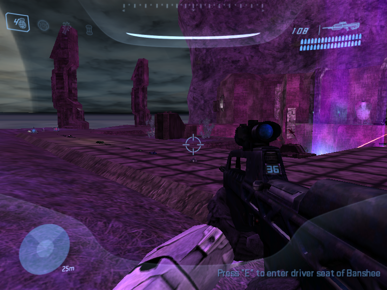 Replaced the nade icons. Plasnades do switch now, unlike in Pitfall. Text is in the bottom right. Motion tracker is Jesse's and is fixed. No more red hud overlay of death. Chief screams in pain when hurt |
||||
|
|
|||||
|
Delicon20 Joined: Oct 3, 2008 
Still here. Still loves bacon |
Posted: Aug 5, 2010 09:47 AM
Msg. 1122 of 9951
hey how'd you get them to switch back and forth? I wanted to fix that but never bothered to figure that out.
|
||||
|
|
|||||
|
DEEhunter Joined: Dec 16, 2006 
|
Posted: Aug 5, 2010 03:21 PM
Msg. 1123 of 9951
Quote: --- Original message by: MoooseGuy Taken from "The hows and whys of level design." Quote: While originality is important and can help a project stand out it is never the only aspect a good level requires. Designers sometimes become so focused on trying to be original that they lose their focus on other important elements. Originality means little if other aspects are horrible, for example the lighting or the gameplay. Developing originality always requires a solid base on which to build, and this is where originality often goes awry. Usually, the problem arises from bad priorities. Without a stable base, original creations cannot be built. Design and create the base first, and then grow the rest into something original. For example, say a designer decided to start a level with the ultimate goal of using purple lighting as an original theme. By deciding this, they have skipped multiple, vital steps and are completely missing the solid base upon which the environment is built. Purple will probably not complement any other color in the level, or match the atmosphere. Therefore it is important to avoid making random design decisions without considering other aspects it will eventually mix with. Adjust the gameplay and colors according to the theme and purpose � not simply to be original. |
||||
|
|
|||||
|
doompig444 Joined: Mar 22, 2010 
Morni� alanti� |
Posted: Aug 5, 2010 04:29 PM
Msg. 1124 of 9951
Quote: --- Original message by: MoooseGuy Update on the hud: -pic- Replaced the nade icons. Plasnades do switch now, unlike in Pitfall. Text is in the bottom right. Motion tracker is Jesse's and is fixed. No more red hud overlay of death. Chief screams in pain when hurt Move text higher up, play with it a bit with the "offset" values. That is too far down; it won't be able to show more than 2 lines of text. |
||||
|
|
|||||
|
abkarch Joined: Mar 20, 2010 
This account is old. Sorry for inappropriate posts |
Posted: Aug 5, 2010 08:43 PM
Msg. 1125 of 9951
first evar animation. (yea i know its idle, but ill do others later)
 |
||||
|
|
|||||
|
doompig444 Joined: Mar 22, 2010
Morni� alanti� |
Posted: Aug 5, 2010 08:51 PM
Msg. 1126 of 9951
up and down = boring. put some rotation into it.
|
||||
|
|
|||||
|
abkarch Joined: Mar 20, 2010
This account is old. Sorry for inappropriate posts |
Posted: Aug 5, 2010 09:11 PM
Msg. 1127 of 9951
Kk i will later. ( im on my ipod right now :S)
|
||||
|
|
|||||
|
ThetianSoldier Joined: May 15, 2010 
Keyboard not found! Press any key to continue... |
Posted: Aug 5, 2010 09:43 PM
Msg. 1128 of 9951
Also, make it a bit longer by stretching out the keys and increasing frame count; it moves up and down to much within the current amount of frames, and doing this method looks better than just decreasing movement.
|
||||
|
|
|||||
|
Advancebo Joined: Jan 14, 2008 
|
Posted: Aug 6, 2010 01:05 AM
Msg. 1129 of 9951
Quote: --- Original message by: abkarch first evar animation. (yea i know its idle, but ill do others later) thats some turbosquid model. |
||||
|
|
|||||
|
Mythril - Screenshot Guru - Joined: Mar 29, 2008 
Jeffrey Albert Waldo |
Posted: Aug 6, 2010 03:17 AM
Msg. 1130 of 9951
Feels a bit too fast, almost like he's panting.
|
||||
|
|
|||||
|
Cocaine Joined: Mar 2, 2009 Can't stop napping. |
Posted: Aug 6, 2010 03:56 AM
Msg. 1131 of 9951
Really? I thought it was actually kind of slow for a person who was holding a 4.5 kilogram weapon.
|
||||
|
|
|||||
|
abkarch Joined: Mar 20, 2010
This account is old. Sorry for inappropriate posts |
Posted: Aug 6, 2010 07:52 AM
Msg. 1132 of 9951
i never said i modeled it did i?
|
||||
|
|
|||||
|
abkarch Joined: Mar 20, 2010
This account is old. Sorry for inappropriate posts |
Posted: Aug 6, 2010 08:24 AM
Msg. 1133 of 9951
ok, to help me get better, does anyone have a "challenge" for me? somethingwith references i can model? nothing like 1000k but say something from halo? preferably something bigger, like a wall from a map, or some base, or something?
removed picture 3 years later because of how awful it is Edited by abkarch on Mar 17, 2013 at 02:46 PM |
||||
|
|
|||||
|
ODX Joined: Jul 26, 2007 
A rare sight, indeed. |
Posted: Aug 6, 2010 11:47 AM
Msg. 1134 of 9951
Are you kidding me? Like... honestly, that's embarrassing, why do people do this?! WHY?! You do not have to be an experienced animator to see this!:
THE ARM DO YOU NOT SEE YOUR ARM IS TOO FAR AWAY AND CLEARLY THE HAND IS NO LONGER ON THE HANDLE?! DO YOU NOT KNOW YOU CAN MOVE THE SHOULDER?! FFFFFFFFFFFFFFFFF- (Excuse my rage but I really never understand this when I see new animators starting out. I'm not saying you're bad horrible terrible worst animator ever, but I'm really confused how people always seem to miss that >_>) |
||||
|
|
|||||
|
abkarch Joined: Mar 20, 2010
This account is old. Sorry for inappropriate posts |
Posted: Aug 6, 2010 11:48 AM
Msg. 1135 of 9951
i can understand you rage, because i cant believe i missed that...thanks.
|
||||
|
|
|||||
|
Invader Veex Joined: Apr 11, 2007 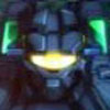
i make poast |
Posted: Aug 6, 2010 11:49 AM
Msg. 1136 of 9951
with the old rigs I used years back i could never move the shoulders >_>
|
||||
|
|
|||||
|
abkarch Joined: Mar 20, 2010
This account is old. Sorry for inappropriate posts |
Posted: Aug 6, 2010 12:00 PM
Msg. 1137 of 9951
aye, fixed the arm and the hand now.
|
||||
|
|
|||||
|
MoooseGuy Joined: Aug 10, 2008
I Approve This Message. |
Posted: Aug 13, 2010 08:44 PM
Msg. 1138 of 9951
A small update on the firefight bsp, this is updated with tunnels (the small buildings between the spires), lighting fixes, skybox fixes, and a new base where stuff spawns and shiz.
Remember that the texturing, lighting, and everything else is not final.  Anyways, peace y'all, I'm going off for a week, see you then. |
||||
|
|
|||||
|
Newbkilla Joined: Mar 9, 2008 
- Artist, Environment Artist, Level Designer - |
Posted: Aug 14, 2010 05:25 PM
Msg. 1139 of 9951
 WIP, made a concept on paper, scanned, modeled etc. Interior, yes, big map, yes, valhalla styled, yes and more. 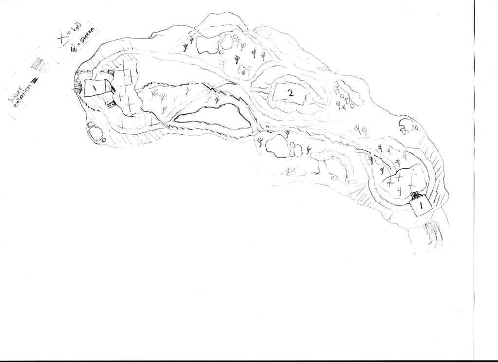 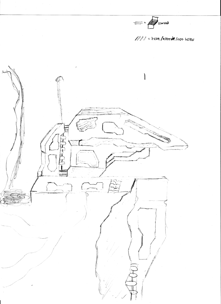 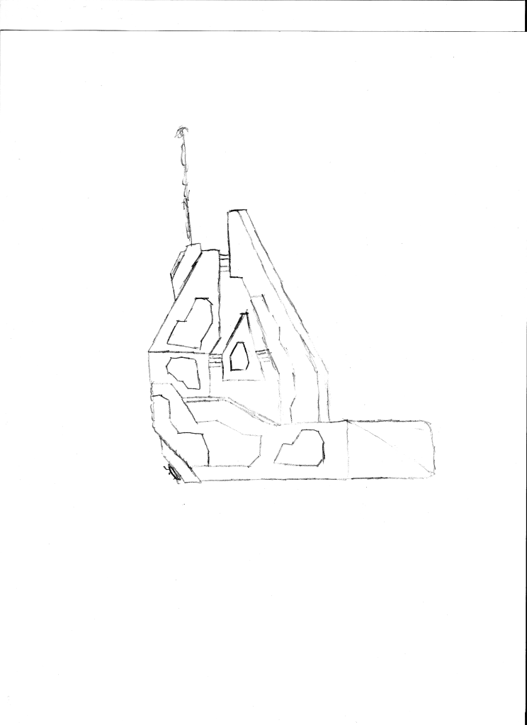 The last image structure is going to be in the middle of the map, in image 1. The other base will be on opposing sides. |
||||
|
|
|||||
|
ODX Joined: Jul 26, 2007
A rare sight, indeed. |
Posted: Aug 14, 2010 05:42 PM
Msg. 1140 of 9951
Quote: --- Original message by: Newbkilla The bottom whole doesn't exactly look Forerunner. Like, you have too many angles in that little part that sticks out. Actually in general, something about it just doesn't look Forerunner enough...might be because it's a WIP and lacks some details but I'm not experienced modeler. |
||||
|
|
|||||
|
eliteslasher Joined: Jun 30, 2008 
Crysis 3!!!!!!! All I have to say. :D |
Posted: Aug 14, 2010 09:22 PM
Msg. 1141 of 9951
Looks pretty good but I sort agree with ODX a bit. IDK what it is though that makes it look weird.
|
||||
|
|
|||||
|
Joshflighter Joined: May 23, 2009 
Former CMT Team Co-Leader |
Posted: Aug 14, 2010 09:39 PM
Msg. 1142 of 9951
Because the top becomes sharp and small it makes this look like it has some akward angles to it. IMO I suggest keeping it a bit bulky while having your design in there. That's what alot of halo forruner is. It doesn't ussually have a house roof at the top. But that's my opinion.
|
||||
|
|
|||||
|
Advancebo Joined: Jan 14, 2008
|
Posted: Aug 14, 2010 09:47 PM
Msg. 1143 of 9951
Get rid of the 2 extrudes on the sides, at the top and bottom half. but keep the bevels.
|
||||
|
|
|||||
|
eliteslasher Joined: Jun 30, 2008
Crysis 3!!!!!!! All I have to say. :D |
Posted: Aug 14, 2010 09:59 PM
Msg. 1144 of 9951
lol. IDK Advance, I was about to suggest the oposite, Isn't there usually more extrudes, or intrudes in this case, in forerunner structure. Or does it even matter?
|
||||
|
|
|||||
|
Newbkilla Joined: Mar 9, 2008
- Artist, Environment Artist, Level Designer - |
Posted: Aug 14, 2010 11:13 PM
Msg. 1145 of 9951
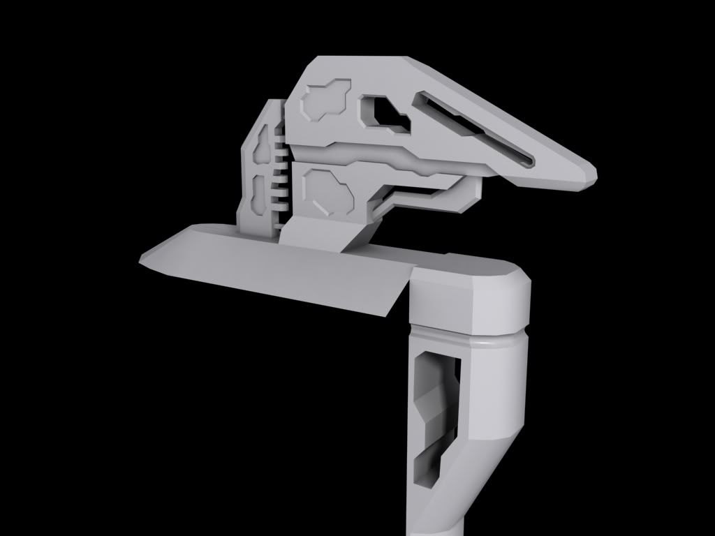
this any better?
 Also 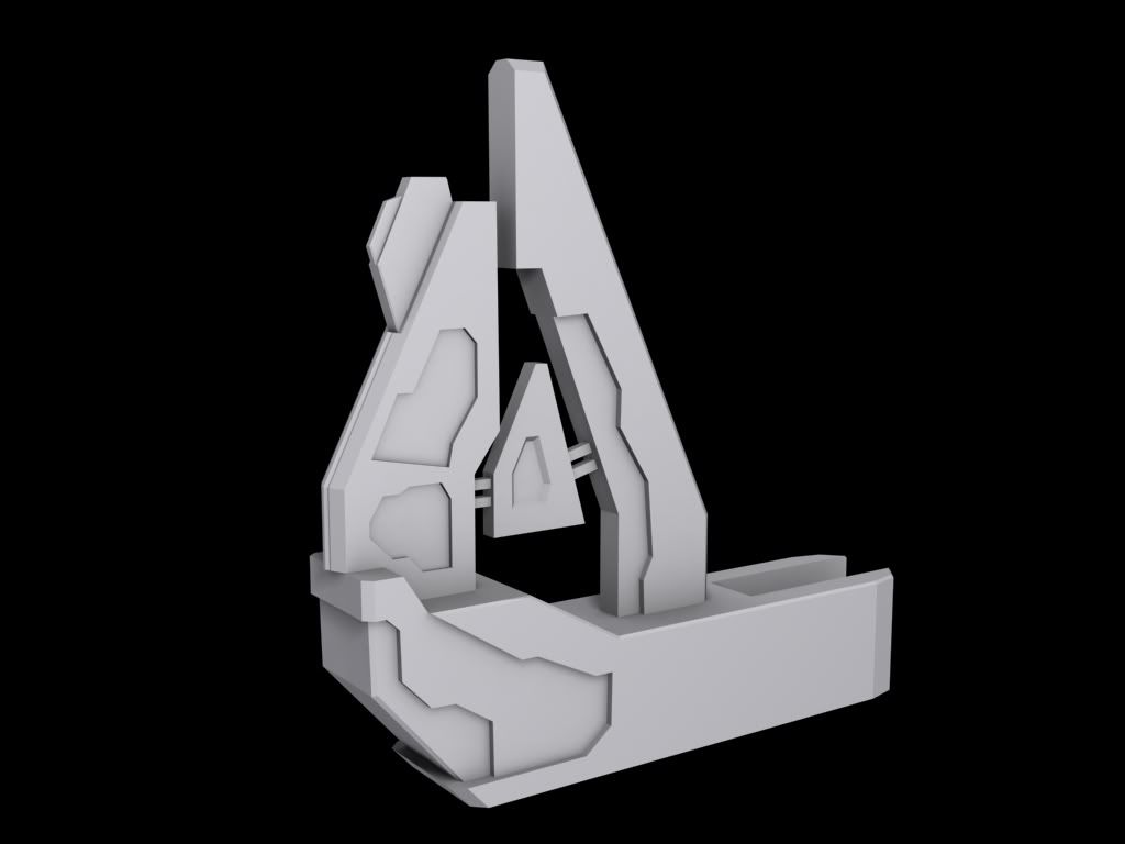 |
||||
|
|
|||||
|
eliteslasher Joined: Jun 30, 2008
Crysis 3!!!!!!! All I have to say. :D |
Posted: Aug 14, 2010 11:18 PM
Msg. 1146 of 9951
U still need to get rid of what is left of that top, the sides should just come straight up IMO. And what is that thing in the middle of the second pic. that definitely needs to go. Leaving that part open won't look bad.
|
||||
|
|
|||||
|
Newbkilla Joined: Mar 9, 2008
- Artist, Environment Artist, Level Designer - |
Posted: Aug 14, 2010 11:20 PM
Msg. 1147 of 9951
It's a capacitor derp :) jk idk, who knows wtf goes on with forerunner and their energy distribution. but seriously, also I changed the top a bit, it's not as sharp, and i less steep of an angle. should I leave that flat??
|
||||
|
|
|||||
|
eliteslasher Joined: Jun 30, 2008
Crysis 3!!!!!!! All I have to say. :D |
Posted: Aug 14, 2010 11:23 PM
Msg. 1148 of 9951
IDK. Personally I would just make it go flat all the way up to the top but the very top plane looks a little bland. It may look better textured and ingame though. What you did in the second picture is acceptable though at the top of the big peak. Having a small 45 angle there to a flat top
Edited by eliteslasher on Aug 14, 2010 at 11:24 PM |
||||
|
|
|||||
|
Hydrogen Joined: Dec 6, 2009 
Wort Wort Wort... |
Posted: Aug 14, 2010 11:28 PM
Msg. 1149 of 9951
slasher check the unmt xfire news please thank you /offtopic
|
||||
|
|
|||||
|
Advancebo Joined: Jan 14, 2008
|
Posted: Aug 15, 2010 02:15 AM
Msg. 1150 of 9951
if your gonna do that to the top, i suggest something like this:
____ .......\___ ..............\ ...............\ etc, not the exact angle, but you get the point. |
||||
|
|
|||||
|
MoooseGuy Joined: Aug 10, 2008
I Approve This Message. |
Posted: Aug 15, 2010 07:04 AM
Msg. 1151 of 9951
Quote: --- Original Message by: DeeHunter Quote: While originality is important and can help a project stand out it is never the only aspect a good level requires. Designers sometimes become so focused on trying to be original that they lose their focus on other important elements. Originality means little if other aspects are horrible, for example the lighting or the gameplay. Developing originality always requires a solid base on which to build, and this is where originality often goes awry. Usually, the problem arises from bad priorities. Without a stable base, original creations cannot be built. Design and create the base first, and then grow the rest into something original. For example, say a designer decided to start a level with the ultimate goal of using purple lighting as an original theme. By deciding this, they have skipped multiple, vital steps and are completely missing the solid base upon which the environment is built. Purple will probably not complement any other color in the level, or match the atmosphere. Therefore it is important to avoid making random design decisions without considering other aspects it will eventually mix with. Adjust the gameplay and colors according to the theme and purpose � not simply to be original. Quote: --- Original message by: MoooseGuy A small update on the firefight bsp, this is updated with tunnels (the small buildings between the spires), lighting fixes, skybox fixes, and a new base where stuff spawns and shiz. Remember that the texturing, lighting, and everything else is not final. Anyways, peace y'all, I'm going off for a week, see you then. So, taking these things in mind, I have reduced the glaring purplicity and started adding other colors into the lighting. Where do you guys think this map structure should go, taking these into consideration? (Posted from Paris |
||||
|
|
|||||
|
Choclate Thunda Joined: Aug 2, 2010 
My BS meter agrees... -Hud Artist/Creator- |
Posted: Aug 17, 2010 01:19 AM
Msg. 1152 of 9951
OK I have decided to start on my new Reach HUD, I made an older one which was actually pretty good... but some things looked weird or to large.
[Pic:]  [Link:] http://a.imageshack.us/img685/3192/haloreachspartanhud.png Any way... here's the first pic that I started around 9:00 A.M. [Pic:]  [Link:] http://a.imageshack.us/img339/7484/reachhudwip1.png Not much, I know but its a good start and totally syncs... But here's some progress I've done about 2 hours ago. [Pic:]  [Link:] http://a.imageshack.us/img94/7627/reachhudwip2.png A lot better... ey? Ill post more updates tomorrow... Cya Then! :] P.S. If your wondering why it took over 12 hours is because I had to go in and out of halo to see if I've got the right color and position. Its really hard when you want it to look good... Edited by Choclate Thunda on Aug 17, 2010 at 01:25 AM |
||||
|
|
|||||
|
eliteslasher Joined: Jun 30, 2008
Crysis 3!!!!!!! All I have to say. :D |
Posted: Aug 17, 2010 02:20 AM
Msg. 1153 of 9951
Cool stuff bro! Loving the HUD! Are you making this to release or for a map or something? Something not being just to show it off.
|
||||
|
|
|||||
|
MoooseGuy Joined: Aug 10, 2008
I Approve This Message. |
Posted: Aug 17, 2010 03:46 AM
Msg. 1154 of 9951
Nice hud, dude!
Very nice, very accurate. Those weapon icons must have taken forever BTW, where's the love for my post, guys? |
||||
|
|
|||||
|
Hydrogen Joined: Dec 6, 2009
Wort Wort Wort... |
Posted: Aug 17, 2010 04:10 AM
Msg. 1155 of 9951
i like your post but i want beta :'[
also moose can i release summer pitfall now? |
||||
|
|
|||||
| Page 33 of 285 | Go to page: · 1 · ... · 30 · 31 · 32 · [33] · 34 · 35 · 36 · ... · 285 · Prev · Next |

|