A Community discussion forum for Halo Custom Edition, Halo 2 Vista, Portal and Halo Machinima
|
| »Forums Index »Halo Custom Edition (Bungie/Gearbox) »Halo CE General Discussion »Bipeds - Work in Process thread [WIP] | 
|
| Page 132 of 192 | Go to page: · 1 · ... · 129 · 130 · 131 · [132] · 133 · 134 · 135 · ... · 192 · Prev · Next |
| Author | Topic: Bipeds - Work in Process thread [WIP] (6707 messages, Page 132 of 192) | ||||
| Moderators: Dennis | |||||
|
anonymous_2009 Joined: Jun 13, 2009 
|
Posted: Jan 28, 2012 10:17 AM
Msg. 4586 of 6707
@qwertyuiop15: grow up lol
|
||||
|
|
|||||
|
Echo77 Joined: Jul 20, 2010 
Humble thyself and hold thy tongue. |
Posted: Jan 28, 2012 01:14 PM
Msg. 4587 of 6707
Quote: --- Original message by: Slap Happy Quote: --- Original message by: delta49 Quote: --- Original message by: Slap Happy Completely started over, new diffuse, new multi, new illumination, I think it's much better, but lacking the grunge/damage that I want to add: http://i1028.photobucket.com/albums/y348/Nervebooger/haloce-20120125-215931.jpg http://i1028.photobucket.com/albums/y348/Nervebooger/halo3_cyborg1.jpg http://i1028.photobucket.com/albums/y348/Nervebooger/haloce-20120125-215946.jpg Very nice 094! (Dim that shouting decal though, rough it up a bit, make it look peeled or torn/scratched) Edited by Slap Happy on Jan 26, 2012 at 12:16 AM Those are pretty good actually, you're not using OS though? Anyways you should take the pics in a brighter area or brighter map. That and make the armor a little brighter. new, and on a brighter map. No this is normal halo ce, not OS. Yeah, he's been shot in the back: http://i1028.photobucket.com/albums/y348/Nervebooger/haloce-20120127-204748.png http://i1028.photobucket.com/albums/y348/Nervebooger/haloce-20120127-204826.png I like it. But the bullet dents don't look quite rightm for some reason. I think I'd get rid of those and add more random damage of indiscernible origin. Quote: --- Original message by: waffles http://img51.imageshack.us/img51/889/haloce2012012812204769.png first biped ill have finished when this is done. i have a lot of other things to do, regions, collision, and other crap. but its my own rig and im proud of it! :3 (shoulders need tweaking). also has its own breather particle collection :P which crashes sapien :/ but not ingame. Do want. Very much. Heretics are mah favoritest. Aside from Insurrectionists, of course. |
||||
|
|
|||||
|
Cheddars Joined: Oct 30, 2010 
Rave to the Grave. |
Posted: Jan 28, 2012 05:25 PM
Msg. 4588 of 6707
Damn I wish My open sauce worked Cause these shaders look sick xd.
|
||||
|
|
|||||
|
Slap Happy Joined: Feb 2, 2009 Life ain't fair, buy a helmet. |
Posted: Jan 29, 2012 02:13 AM
Msg. 4589 of 6707
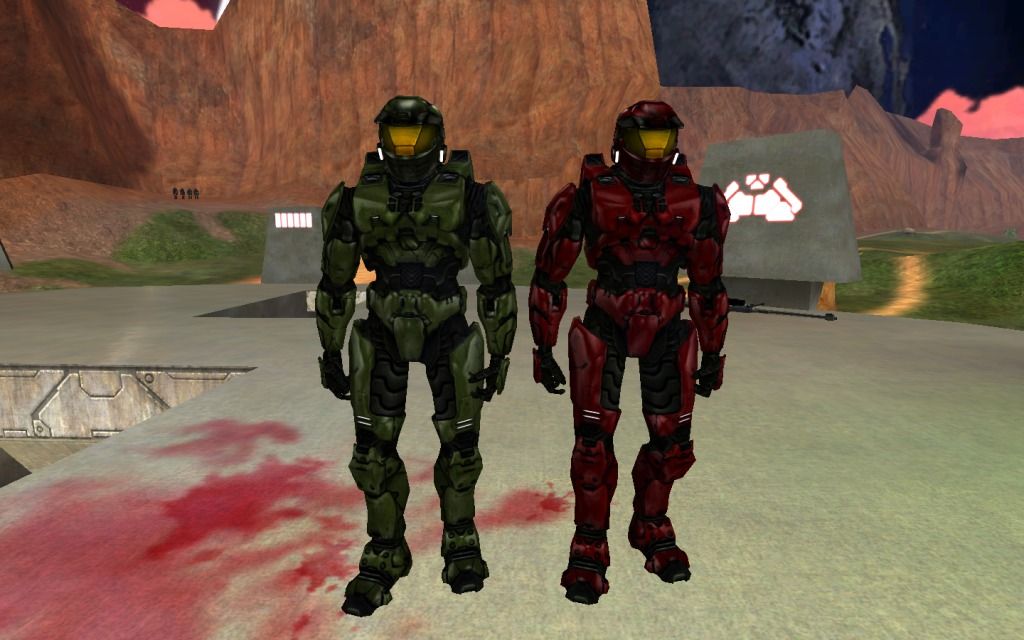
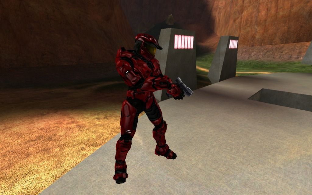
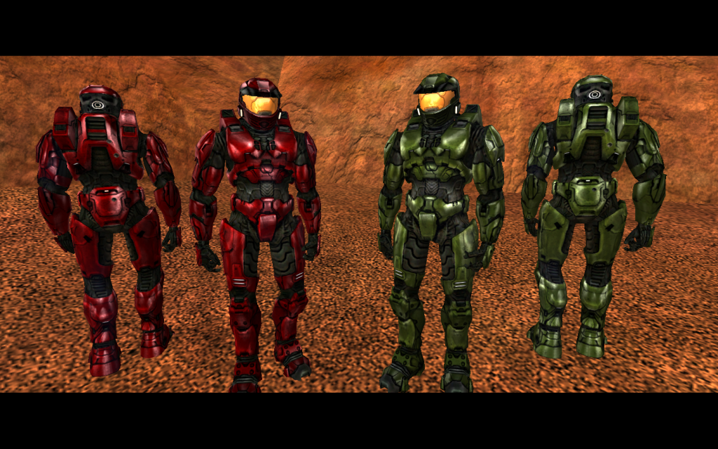
Yes, I get that some ppl don't like the fake bump, and that they are dark, and too black. Hence, custom edition, the ability to make them custom. If all bipeds looked that same, that would suck. - re-did the visor, as well as the armor, again:
   |
||||
|
|
|||||
|
LegionofShadows Joined: Jul 10, 2011 
The Red Pill is strong in this one. |
Posted: Jan 29, 2012 02:16 AM
Msg. 4590 of 6707
good job, they look less from a cartoon now.
I give you the approval howl. YAAAAAWL. |
||||
|
|
|||||
|
anonymous_2009 Joined: Jun 13, 2009
|
Posted: Jan 29, 2012 10:24 AM
Msg. 4591 of 6707
still too dark, and too shiny.
|
||||
|
|
|||||
|
Echo77 Joined: Jul 20, 2010
Humble thyself and hold thy tongue. |
Posted: Jan 29, 2012 10:33 AM
Msg. 4592 of 6707
Quote: --- Original message by: anonymous_2009 still too dark, and too shiny. Maybe that's the aesthetic style he's trying for. Not everything has to match up to its stock counterpart. |
||||
|
|
|||||
|
anonymous_2009 Joined: Jun 13, 2009
|
Posted: Jan 29, 2012 02:38 PM
Msg. 4593 of 6707
Quote: --- Original message by: Echo77 Quote: --- Original message by: anonymous_2009 still too dark, and too shiny. Maybe that's the aesthetic style he's trying for. Not everything has to match up to its stock counterpart. excuse?... i'm not saying make it look like it looks in it's counterpart. I'm saying that so he can make it look good... That's like making a warthog out of a box, then people saying it's just a box. That's the style I want it to be... no. |
||||
|
|
|||||
|
Newbkilla Joined: Mar 9, 2008 
- Artist, Environment Artist, Level Designer - |
Posted: Jan 29, 2012 02:58 PM
Msg. 4594 of 6707
Quote: --- Original message by: Echo77 Quote: --- Original message by: anonymous_2009 still too dark, and too shiny. Maybe that's the aesthetic style he's trying for. Not everything has to match up to its stock counterpart. Except the spartans look like they are covered in lube because they are so shiny and glossy. |
||||
|
|
|||||
|
Slap Happy Joined: Feb 2, 2009 Life ain't fair, buy a helmet. |
Posted: Jan 30, 2012 04:05 AM
Msg. 4595 of 6707
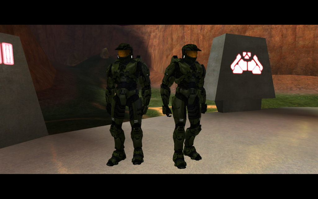
I always lube my masterchief. (Spontaneous combustion is a serious concern) If it looks to0 damaged, no one will play with my masterchief. If I get too much lube or gloss, you all get afraid that it might end up somewhere you don't want it like . . . in your map. I got rid of the bumps, and you seem pleased by that, but now you are afraid of the lube? What about just the visor to see how it feels?
I don't get it . . . are you all *girls* ? /snicker Yes, I toned down the shine, now it looks like a very light coat of cocoa butter. the most recent pics I had ticked "blend normals" on the model to see how it would look along with bright reflection, I unticked it, dropped the lube and *GASP!* and now it looks like it belongs in an old spice commercial. (look at your masterchief, now look at mine, now look at yours, now back at mine, I'm on a horse!). I will post an update tomorrow, minus the lube. |
||||
|
|
|||||
|
Delicon20 Joined: Oct 3, 2008 
Still here. Still loves bacon |
Posted: Jan 30, 2012 08:07 AM
Msg. 4596 of 6707
Quote: --- Original message by: Slap Happy I always lube my masterchief. (Spontaneous combustion is a serious concern) If it looks to0 damaged, no one will play with my masterchief. If I get too much lube or gloss, you all get afraid that it might end up somewhere you don't want it like . . . in your map. I got rid of the bumps, and you seem pleased by that, but now you are afraid of the lube? What about just the visor to see how it feels? I don't get it . . . are you all *girls* ? /snicker Yes, I toned down the shine, now it looks like a very light coat of cocoa butter. the most recent pics I had ticked "blend normals" on the model to see how it would look along with bright reflection, I unticked it, dropped the lube and *GASP!* and now it looks like it belongs in an old spice commercial. (look at your masterchief, now look at mine, now look at yours, now back at mine, I'm on a horse!). I will post an update tomorrow, minus the lube. this has been another fabulous episode of seemingly sexy times with slap happy, tune in next week when he teaches us how to work the shaft on the warthog! srsly tho i'm likin this spartan, is it too much to ask for something shiny once in awhile? (I bet I just sounded like your girlfriend |
||||
|
|
|||||
|
anonymous_2009 Joined: Jun 13, 2009
|
Posted: Jan 30, 2012 10:16 AM
Msg. 4597 of 6707
Quote: --- Original message by: qwertyuiop15 Quote: --- Original message by: everyone everything must look as realistic as possible, regardless of what looks good because this is a videogame Edited by qwertyuiop15 on Jan 30, 2012 at 01:50 AM Note how I refrained from using the word "realistic". So I don't know what you talking about, it can be unrealistic and look good, but it doesn't... |
||||
|
|
|||||
|
Jaz Joined: Mar 21, 2010 
[Insert sarcastic comment here] |
Posted: Jan 30, 2012 10:45 AM
Msg. 4598 of 6707
Quote: --- Original message by: anonymous_2009 Quote: --- Original message by: Echo77 Quote: --- Original message by: anonymous_2009 still too dark, and too shiny. Maybe that's the aesthetic style he's trying for. Not everything has to match up to its stock counterpart. excuse?... i'm not saying make it look like it looks in it's counterpart. I'm saying that so he can make it look good... That's like making a warthog out of a box, then people saying it's just a box. That's the style I want it to be... no. And yet somehow Minecraft succeeded with the art style of 50 year old graphics... |
||||
|
|
|||||
|
anonymous_2009 Joined: Jun 13, 2009
|
Posted: Jan 30, 2012 12:27 PM
Msg. 4599 of 6707
Quote: --- Original message by: Jaz Quote: --- Original message by: anonymous_2009 Quote: --- Original message by: Echo77 Quote: --- Original message by: anonymous_2009 still too dark, and too shiny. Maybe that's the aesthetic style he's trying for. Not everything has to match up to its stock counterpart. excuse?... i'm not saying make it look like it looks in it's counterpart. I'm saying that so he can make it look good... That's like making a warthog out of a box, then people saying it's just a box. That's the style I want it to be... no. And yet somehow Minecraft succeeded with the art style of 50 year old graphics... And yet the texture's are not too dark or shiny and don't look stupid... your example is pathetic. Your basing your argument on pixel sized textures and comparing it to current gen textures using millions of pixels. Fail. |
||||
|
|
|||||
|
TM_updates Joined: Aug 31, 2011 
Superior to you, Superior Musclez near Brussels |
Posted: Jan 30, 2012 12:27 PM
Msg. 4600 of 6707
And yet that comment in no way actually pertains to the actual content and point of anonymous' post.
E: I got ninja'd :P Edited by TM_updates on Jan 30, 2012 at 12:28 PM |
||||
|
|
|||||
|
Jaz Joined: Mar 21, 2010
[Insert sarcastic comment here] |
Posted: Jan 30, 2012 12:31 PM
Msg. 4601 of 6707
Quote: --- Original message by: anonymous_2009 Quote: --- Original message by: Jaz Quote: --- Original message by: anonymous_2009 Quote: --- Original message by: Echo77 Quote: --- Original message by: anonymous_2009 still too dark, and too shiny. Maybe that's the aesthetic style he's trying for. Not everything has to match up to its stock counterpart. excuse?... i'm not saying make it look like it looks in it's counterpart. I'm saying that so he can make it look good... That's like making a warthog out of a box, then people saying it's just a box. That's the style I want it to be... no. And yet somehow Minecraft succeeded with the art style of 50 year old graphics... And yet the texture's are not too dark or shiny and don't look stupid... your example is pathetic. Your basing your argument on pixel sized textures and comparing it to current gen textures using millions of pixels. Fail. It was a joke... Seriously, you need to get in on the graphics obsessor jokes... |
||||
|
|
|||||
|
Bobblehob Joined: Aug 29, 2010 
|
Posted: Jan 30, 2012 06:23 PM
Msg. 4602 of 6707
Quote: --- Original message by: Jaz It was a joke... Seriously, you need to get in on the graphics obsessor jokes... *facepalm* |
||||
|
|
|||||
|
Slap Happy Joined: Feb 2, 2009 Life ain't fair, buy a helmet. |
Posted: Jan 30, 2012 10:45 PM
Msg. 4603 of 6707
   and some cocoabutter 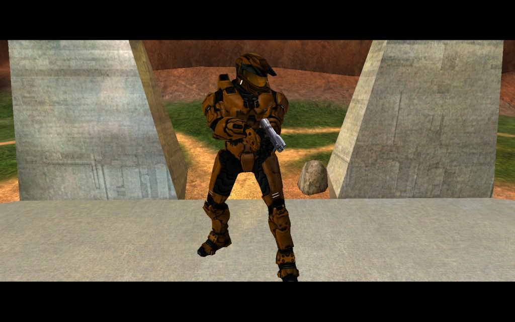 |
||||
|
|
|||||
|
XlzQwerty1 Joined: Aug 6, 2009 
|
Posted: Jan 30, 2012 11:00 PM
Msg. 4604 of 6707
To be honest they look worse without the very shiny lubricant because of the darkugly fakebump.
/looked much better before, ignore anonymous2009/ Edited by XlzQwerty1 on Jan 30, 2012 at 11:01 PM |
||||
|
|
|||||
|
anonymous_2009 Joined: Jun 13, 2009
|
Posted: Jan 31, 2012 12:29 AM
Msg. 4605 of 6707
Look'smuch better than before, but still a tad too dark. just look at the comparison in texture brightness between the environment and your shaders. my bad if that doesn't make sence, been up town...
and @XlzQwerty1. Who the heck are you? you are saying ignore me yet i give an honest opinion and realistic crit. Just because some people cry about my crit doesn;t mean it's invalid, so stfu :L |
||||
|
|
|||||
|
Jaz Joined: Mar 21, 2010
[Insert sarcastic comment here] |
Posted: Jan 31, 2012 01:03 AM
Msg. 4606 of 6707
They look a lot better now. Over-the-top shininess does not look good, at all.
|
||||
|
|
|||||
|
Spartan314 Joined: Aug 21, 2010 
Former biped rigger & FP animator |
Posted: Jan 31, 2012 01:10 AM
Msg. 4607 of 6707
lol he has BULLET holes in his armor. Did some drunk marine shoot at him or something? XD
|
||||
|
|
|||||
|
Cheddars Joined: Oct 30, 2010
Rave to the Grave. |
Posted: Jan 31, 2012 06:03 AM
Msg. 4608 of 6707
Quote: --- Original message by: waffles lol if nothing else is working, delete every single file related to halo ce and open sauce, and re-install everything. i guess either i was lucky or something cuz open sauce installed the first time for me. btw! using that sexy multipurpose technique from your tutorial! makes multipurposes look very pretty! :3 Edited by waffles on Jan 28, 2012 at 07:28 PM lol thanks |
||||
|
|
|||||
|
XlzQwerty1 Joined: Aug 6, 2009
|
Posted: Jan 31, 2012 08:50 AM
Msg. 4609 of 6707
Fakebump is too dark and thick, makes it look bad.
|
||||
|
|
|||||
|
Delicon20 Joined: Oct 3, 2008
Still here. Still loves bacon |
Posted: Feb 1, 2012 04:05 PM
Msg. 4610 of 6707
Quote: --- Original message by: Slap Happy http://i1028.photobucket.com/albums/y348/Nervebooger/haloce-20120130-203534.png http://i1028.photobucket.com/albums/y348/Nervebooger/haloce-20120130-203522.png http://i1028.photobucket.com/albums/y348/Nervebooger/haloce-20120130-203419.png and some cocoabutter http://i1028.photobucket.com/albums/y348/Nervebooger/haloce-20120130-204007.jpg to put it bluntly: ruined put the shine back I mean really do you want a spartan that pleases the public like so many before it or do you want one that stands out to the unique few who wants something different? Edited by Delicon20 on Feb 1, 2012 at 04:07 PM |
||||
|
|
|||||
|
Jaz Joined: Mar 21, 2010
[Insert sarcastic comment here] |
Posted: Feb 1, 2012 04:55 PM
Msg. 4611 of 6707
Quote: --- Original message by: Delicon20 Quote: --- Original message by: Slap Happy http://i1028.photobucket.com/albums/y348/Nervebooger/haloce-20120130-203534.png http://i1028.photobucket.com/albums/y348/Nervebooger/haloce-20120130-203522.png http://i1028.photobucket.com/albums/y348/Nervebooger/haloce-20120130-203419.png and some cocoabutter http://i1028.photobucket.com/albums/y348/Nervebooger/haloce-20120130-204007.jpg to put it bluntly: ruined put the shine back I mean really do you want a spartan that pleases the public like so many before it or do you want one that stands out to the unique few who wants something different? Edited by Delicon20 on Feb 1, 2012 at 04:07 PM Depends on the lighting of any map he makes. If he puts that thing into Bloodgulch or a map with similar lighting, and restores the shininess to the biped, it will look absolutely terrible and will stand out WAY too much. If he develops a map that actually has a planet that is dangerously close to the sun or has insanely shiny lightbulbs installed, it would make sense. |
||||
|
|
|||||
|
XlzQwerty1 Joined: Aug 6, 2009
|
Posted: Feb 1, 2012 05:03 PM
Msg. 4612 of 6707
Quote: --- Original message by: Jaz Quote: --- Original message by: Delicon20 Quote: --- Original message by: Slap Happy http://i1028.photobucket.com/albums/y348/Nervebooger/haloce-20120130-203534.png http://i1028.photobucket.com/albums/y348/Nervebooger/haloce-20120130-203522.png http://i1028.photobucket.com/albums/y348/Nervebooger/haloce-20120130-203419.png and some cocoabutter http://i1028.photobucket.com/albums/y348/Nervebooger/haloce-20120130-204007.jpg to put it bluntly: ruined put the shine back I mean really do you want a spartan that pleases the public like so many before it or do you want one that stands out to the unique few who wants something different? Edited by Delicon20 on Feb 1, 2012 at 04:07 PM Depends on the lighting of any map he makes. If he puts that thing into Bloodgulch or a map with similar lighting, and restores the shininess to the biped, it will look absolutely terrible and will stand out WAY too much. If he develops a map that actually has a planet that is dangerously close to the sun or has insanely shiny lightbulbs installed, it would make sense. This isn't about realism... |
||||
|
|
|||||
|
Delicon20 Joined: Oct 3, 2008
Still here. Still loves bacon |
Posted: Feb 1, 2012 08:39 PM
Msg. 4613 of 6707
if gaming was supposed to be realistic and make sense then we'd have virtual fatties and ugly people up the ass, and while that would be nice for games like fallout, I would rather focus on aesthetics in halo, at least as far as character designs go.
ALL HAIL HARD CANDY CHIEF OR BE OBESE!!!!!! |
||||
|
|
|||||
|
Slap Happy Joined: Feb 2, 2009 Life ain't fair, buy a helmet. |
Posted: Feb 2, 2012 09:50 PM
Msg. 4614 of 6707
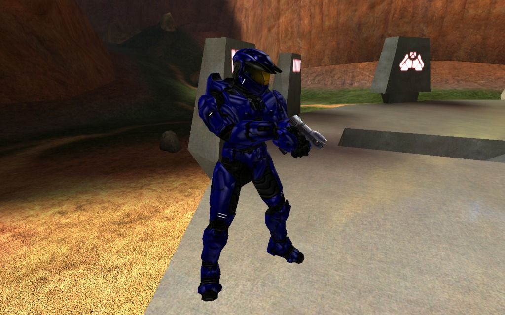
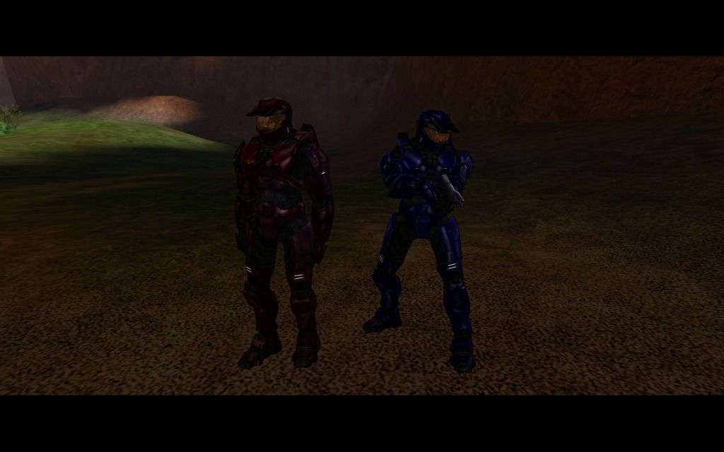
Jolly Rancher Shader, and newer visor (yes, I know it strays from Mark V style)
  |
||||
|
|
|||||
|
Spartan314 Joined: Aug 21, 2010
Former biped rigger & FP animator |
Posted: Feb 2, 2012 09:54 PM
Msg. 4615 of 6707
Quote: --- Original message by: Slap Happy Jolly Rancher Shader, and newer visor (yes, I know it strays from Mark V style) http://i1028.photobucket.com/albums/y348/Nervebooger/haloce-20120202-193930.png http://i1028.photobucket.com/albums/y348/Nervebooger/haloce-20120202-194318.jpg Me very like. Except the visor shader. Too cartoony compared to the armor. Even though the armor is cartoony anyway. |
||||
|
|
|||||
|
XlzQwerty1 Joined: Aug 6, 2009
|
Posted: Feb 2, 2012 09:55 PM
Msg. 4616 of 6707
Visor needs some work, the armor looks great.
|
||||
|
|
|||||
|
Delicon20 Joined: Oct 3, 2008
Still here. Still loves bacon |
Posted: Feb 2, 2012 10:28 PM
Msg. 4617 of 6707
Quote: --- Original message by: Slap Happy Jolly Rancher Shader, and newer visor (yes, I know it strays from Mark V style) http://i1028.photobucket.com/albums/y348/Nervebooger/haloce-20120202-193930.png http://i1028.photobucket.com/albums/y348/Nervebooger/haloce-20120202-194318.jpg *currently drooling uncontrollably* |
||||
|
|
|||||
|
anonymous_2009 Joined: Jun 13, 2009
|
Posted: Feb 3, 2012 12:01 PM
Msg. 4618 of 6707
I still see evidence of "fake bump". As I see black lines... and it just looks like plastic and silly...
|
||||
|
|
|||||
|
Jaz Joined: Mar 21, 2010
[Insert sarcastic comment here] |
Posted: Feb 3, 2012 12:16 PM
Msg. 4619 of 6707
Logical view: It's worse than before. Too shiny and stupid.
My view now: It looks awesome! I love the style you're taking. :) |
||||
|
|
|||||
|
abkarch Joined: Mar 20, 2010 
This account is old. Sorry for inappropriate posts |
Posted: Feb 3, 2012 03:33 PM
Msg. 4620 of 6707
I liek them. alot.
|
||||
|
|
|||||
| Page 132 of 192 | Go to page: · 1 · ... · 129 · 130 · 131 · [132] · 133 · 134 · 135 · ... · 192 · Prev · Next |

|