A Community discussion forum for Halo Custom Edition, Halo 2 Vista, Portal and Halo Machinima
|
| »Forums Index »Halo Custom Edition (Bungie/Gearbox) »Halo CE General Discussion »New Channel art. | 
|
| Page 1 of 2 | Go to page: · [1] · 2 · Next |
| Author | Topic: New Channel art. (43 messages, Page 1 of 2) | ||||
| Moderators: Dennis | |||||
|
Ubermaniac Joined: Dec 22, 2014 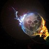
Bleach. Y'know what I mean? |
Posted: Jan 9, 2015 02:17 AM
Msg. 1 of 43
I made some new channel art, wondering if you guy's like it?
 Edited by OpTic on Jan 9, 2015 at 02:18 AM |
||||
|
|
|||||
|
rcghalohell Joined: Feb 25, 2009 
I can jump?Weeeee (pop!) (No1 heard from it again) |
Posted: Jan 9, 2015 02:23 AM
Msg. 2 of 43
this looks good
but nothing beats the picture to the right <<< |
||||
|
|
|||||
|
Ubermaniac Joined: Dec 22, 2014
Bleach. Y'know what I mean? |
Posted: Jan 9, 2015 02:28 AM
Msg. 3 of 43
Thats left m8...
|
||||
|
|
|||||
|
Spartan314 Joined: Aug 21, 2010 
Former biped rigger & FP animator |
Posted: Jan 9, 2015 03:44 AM
Msg. 4 of 43
It looks nice.
Is there some symbolic meaning to it? |
||||
|
|
|||||
|
Ubermaniac Joined: Dec 22, 2014
Bleach. Y'know what I mean? |
Posted: Jan 9, 2015 04:03 AM
Msg. 5 of 43
The beauty is that it is your choice to see it as the fall of reach, or some s***
|
||||
|
|
|||||
|
Ubermaniac Joined: Dec 22, 2014
Bleach. Y'know what I mean? |
Posted: Jan 9, 2015 09:04 AM
Msg. 6 of 43
I photoshopped it m8.
Should I add text? Edited by OpTic on Jan 9, 2015 at 09:07 AM |
||||
|
|
|||||
|
xnx Joined: Feb 12, 2013 
h2 marine anims or i detonate the vest |
Posted: Jan 9, 2015 02:06 PM
Msg. 7 of 43
I don't like it. There's no theme or overall general image you're trying to get across. I understand the cool PS photoshop logo thing that people have fun with, and I've made them too. However, your color scheme is blue, yellow/orange, with a bit of green and red subtly added. So technically, I don't think you had a plan for color use and placement. Honestly the helmet is incredibly dull in comparison to the generic fire/energy in the background which steal all the attention. Contrast is incredibly important with image creation. Also, the lens flare seems really out of place, even though it is very faded. Assuming it's supposed to be sun glare or something, that side of the helmet should be brightened to accommodate. Similarly, the helmet should have red/blue color reflected on it from the flames/energy. Also, I'd suggest symmetry for this project, something about the diagonal theme looks off.
sry for the txt wall bby just my crit I do a lot of digital artwork and the occasional 100% PS project for fun. Here's an album cover I made about a week ago if you're looking for inspiration.  Edited by xnx on Jan 9, 2015 at 02:07 PM |
||||
|
|
|||||
|
Spartan314 Joined: Aug 21, 2010
Former biped rigger & FP animator |
Posted: Jan 9, 2015 02:10 PM
Msg. 8 of 43
Quote: --- Original message by: OpTic The beauty is that it is your choice to see it as the fall of reach, or some s*** Yeah... If there's no symbolic thing going on... I have no idea what is. All I see is a bunch of pretty colors. |
||||
|
|
|||||
|
xx_kiLLaz_XX Joined: Nov 29, 2014 
Opensauce 4.0 is finally out! |
Posted: Jan 9, 2015 06:18 PM
Msg. 9 of 43
Quote: --- Original message by: Mystryb0y I like the clearly visible wallpaper site link on the bottom right of "your" channel art. Retard, it's photoshopped Here's original image: (no watermark)  EDIT:YOUR A COLOSSAL RETARTED A$$ B!tch Edited by mdestroyer117 on Jan 9, 2015 at 06:20 PM |
||||
|
|
|||||
|
UnevenElefant5 Joined: May 3, 2008 
its been fun yall, i'll never forget this site :') |
Posted: Jan 9, 2015 09:07 PM
Msg. 10 of 43
what does "it's photoshopped" have to do with the fact that there's a watermark on the image? If it's photoshopped then that means it's even easier to remove the watermark with something like the clone stamp.
jesus you're ornery, go pet a dog or something |
||||
|
|
|||||
|
Vergil Joined: Jun 13, 2011 
you're just mad cuz you're angry |
Posted: Jan 9, 2015 10:40 PM
Msg. 11 of 43
Quote: --- Original message by: UnevenElefant5 what does "it's photoshopped" have to do with the fact that there's a watermark on the image? If it's photoshopped then that means it's even easier to remove the watermark with something like the clone stamp. jesus you're ornery, go pet a dog or something he added it himself, lol |
||||
|
|
|||||
|
Super Flanker Joined: Oct 5, 2012 
The length of your life depends on my aim. |
Posted: Jan 10, 2015 09:01 AM
Msg. 12 of 43
Quote: --- Original message by: OpTic I made some new channel art, wondering if you guy's like it? http://i.imgur.com/MiHPlz4.jpg?1 Edited by OpTic on Jan 9, 2015 at 02:18 AM This looks more to me like some googled .png images strapped together in photoshop. |
||||
|
|
|||||
|
gruntfromhalo Joined: Nov 21, 2007 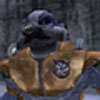
actual loli |
Posted: Jan 10, 2015 09:59 PM
Msg. 13 of 43
To be blunt everything ITT looks terrible from a graphic design standpoint (sorry xnx, even yours).
What you want in a logo is for it to be memorable and distinctive. In general, you want it to be as simple as possible, 'cause then it's easier to identify it. I'd type out more but you guys are so far off I'd have to write an entire essay so just do some googling. The problem is that OP and xnx are trying to make logos but not using design philosophy for logos, and approaching the project like you would a normal image. Anyway if this is the art show-off thread here's something I drew a while ago that would make a terrible logo.  |
||||
|
|
|||||
|
Ubermaniac Joined: Dec 22, 2014
Bleach. Y'know what I mean? |
Posted: Jan 10, 2015 10:21 PM
Msg. 14 of 43
I's just for a profile pic, so i think it's fine.
|
||||
|
|
|||||
|
Banshee64 Joined: Dec 4, 2012 
oify |
Posted: Jan 10, 2015 10:45 PM
Msg. 15 of 43
This thread needs more lens flares and mt. dew promos
|
||||
|
|
|||||
|
Ubermaniac Joined: Dec 22, 2014
Bleach. Y'know what I mean? |
Posted: Jan 10, 2015 10:55 PM
Msg. 16 of 43
Quote: --- Original message by: Banshee64 This thread needs more lens flares and mt. dew promos This exactly what i need. Thank you. |
||||
|
|
|||||
|
gruntfromhalo Joined: Nov 21, 2007
actual loli |
Posted: Jan 10, 2015 11:14 PM
Msg. 17 of 43
Quote: --- Original message by: OpTic I's just for a profile pic, so i think it's fine. Profile pic for a channel though, so it's about branding and catching customers. Profile pic for halomaps or whatever is different. |
||||
|
|
|||||
|
Banshee64 Joined: Dec 4, 2012
oify |
Posted: Jan 10, 2015 11:29 PM
Msg. 18 of 43
any time, i'm here for you friend
|
||||
|
|
|||||
|
Super Flanker Joined: Oct 5, 2012
The length of your life depends on my aim. |
Posted: Jan 11, 2015 08:48 AM
Msg. 19 of 43
  Something I made for clan match. Everything is mine except for the BG grungish texture which I either bought from cg textures or VC. |
||||
|
|
|||||
|
Banshee64 Joined: Dec 4, 2012
oify |
Posted: Jan 11, 2015 01:03 PM
Msg. 20 of 43
20 hours in photoshop
do not steal!!!!!!  |
||||
|
|
|||||
|
xnx Joined: Feb 12, 2013
h2 marine anims or i detonate the vest |
Posted: Jan 11, 2015 01:44 PM
Msg. 21 of 43
Quote: --- Original message by: gruntfromhalo The problem is that OP and xnx are trying to make logos but not using design philosophy for logos, and approaching the project like you would a normal image. Ehr, well, even though I said it was for an album cover, it wasn't actually meant to be a logo, but just something I had fun creating in photoshop. To give context to the situation I made an awful dubstep remix of a song for my friend who has an elitist taste in music (for christmas) and tried to make a typically EDM image for the video on YouTube. I couldn't draw anything because my stylus pen was broken so I just created it using different images pulled from google. I look at it more as artwork rather than a memorable logo, considering it was never meant to actually be "published" for mad $$$. |
||||
|
|
|||||
|
Spartan314 Joined: Aug 21, 2010
Former biped rigger & FP animator |
Posted: Jan 11, 2015 02:19 PM
Msg. 22 of 43
Quote: --- Original message by: Banshee64 20 hours in photoshop do not steal!!!!!! https://dl.dropboxusercontent.com/u/43157158/halomeme.png 10/10 Would use. |
||||
|
|
|||||
|
Ubermaniac Joined: Dec 22, 2014
Bleach. Y'know what I mean? |
Posted: Jan 11, 2015 05:13 PM
Msg. 23 of 43
Oh! Banshee, make me channel art.Will pay 69$
|
||||
|
|
|||||
|
rcghalohell Joined: Feb 25, 2009
I can jump?Weeeee (pop!) (No1 heard from it again) |
Posted: Jan 11, 2015 09:21 PM
Msg. 24 of 43
Quote: --- Original message by: OpTic Thats left m8... sorry about that, was doing this late at night and kinda rushed, but anyways yea, to the left |
||||
|
|
|||||
|
Banshee64 Joined: Dec 4, 2012
oify |
Posted: Jan 11, 2015 11:38 PM
Msg. 25 of 43
You haven't been here long enough to know that this forum's very foundation consists of nothing but memes, too many posts with no memes and the forum could collapse!
~what a disaster~ |
||||
|
|
|||||
|
BKTiel Joined: Mar 18, 2014 
strong independent bird needs no cage |
Posted: Jan 12, 2015 12:20 AM
Msg. 26 of 43
Quote: --- Original message by: SS Flanker https://fbcdn-sphotos-c-a.akamaihd.net/hphotos-ak-xpf1/v/t1.0-9/10524307_1518574138416339_4906002519956003636_n.jpg?oh=1dcb044cc12de40c6a3194406b494678&oe=5567A55B&__gda__=1430070116_b798a30b270c392c7b63a8e2d2f3606e https://fbcdn-sphotos-e-a.akamaihd.net/hphotos-ak-xaf1/v/t1.0-9/10247814_1518574151749671_9199497918767279042_n.jpg?oh=cc75f0520a8e3fb83b81b9ea815a53d8&oe=5524BA5A&__gda__=1428883949_9351d92b6b28ab02225b1fc9191d15b7 Something I made for clan match. Everything is mine except for the BG grungish texture which I either bought from cg textures or VC. Too busy. |
||||
|
|
|||||
|
Cheddars Joined: Oct 30, 2010 
Rave to the Grave. |
Posted: Jan 12, 2015 07:26 AM
Msg. 27 of 43
Quote: --- Original message by: mdestroyer117 Quote: --- Original message by: Mystryb0y I like the clearly visible wallpaper site link on the bottom right of "your" channel art. Retard, it's photoshopped Here's original image: (no watermark) http://p1.pichost.me/i/58/1821334.jpg EDIT:YOUR A COLOSSAL RETARTED A$$ B!tch Edited by mdestroyer117 on Jan 9, 2015 at 06:20 PM  |
||||
|
|
|||||
|
Spartan314 Joined: Aug 21, 2010
Former biped rigger & FP animator |
Posted: Jan 12, 2015 05:26 PM
Msg. 28 of 43
Quote: --- Original message by: Cheddars Quote: --- Original message by: mdestroyer117 Quote: --- Original message by: Mystryb0y I like the clearly visible wallpaper site link on the bottom right of "your" channel art. Retard, it's photoshopped Here's original image: (no watermark) http://p1.pichost.me/i/58/1821334.jpg EDIT:YOUR A COLOSSAL RETARTED A$$ B!tch Edited by mdestroyer117 on Jan 9, 2015 at 06:20 PM http://i0.kym-cdn.com/photos/images/newsfeed/000/173/576/Wat8.jpg?1315930535 Pffft, I have to say, I made the same mistake when I was in 4th or 5th grade. |
||||
|
|
|||||
|
SGT Arroyo Joined: Jul 23, 2014 
golden |
Posted: Jan 12, 2015 06:46 PM
Msg. 29 of 43
Quote: --- Original message by: Cheddars that picture is channel art.Quote: --- Original message by: mdestroyer117 Quote: --- Original message by: Mystryb0y I like the clearly visible wallpaper site link on the bottom right of "your" channel art. Retard, it's photoshopped Here's original image: (no watermark) http://p1.pichost.me/i/58/1821334.jpg EDIT:YOUR A COLOSSAL RETARTED A$$ B!tch Edited by mdestroyer117 on Jan 9, 2015 at 06:20 PM http://i0.kym-cdn.com/photos/images/newsfeed/000/173/576/Wat8.jpg?1315930535 |
||||
|
|
|||||
|
gruntfromhalo Joined: Nov 21, 2007
actual loli |
Posted: Jan 12, 2015 08:36 PM
Msg. 30 of 43
Quote: --- Original message by: xnx Well I never said I knew how to readEhr, well, even though I said it was for an album cover, it wasn't actually meant to be a logo, |
||||
|
|
|||||
|
Ubermaniac Joined: Dec 22, 2014
Bleach. Y'know what I mean? |
Posted: Jan 12, 2015 09:05 PM
Msg. 31 of 43
A lot of people were rude.I is heartsbrokenz
|
||||
|
|
|||||
|
Spartan314 Joined: Aug 21, 2010
Former biped rigger & FP animator |
Posted: Jan 12, 2015 09:25 PM
Msg. 32 of 43
Welcome to Halomaps.
|
||||
|
|
|||||
|
Ubermaniac Joined: Dec 22, 2014
Bleach. Y'know what I mean? |
Posted: Jan 12, 2015 09:37 PM
Msg. 33 of 43
Quote: --- Original message by: Spartan314 Welcome to Halomaps. lel. |
||||
|
|
|||||
|
xx_kiLLaz_XX Joined: Nov 29, 2014
Opensauce 4.0 is finally out! |
Posted: Jan 13, 2015 06:30 PM
Msg. 34 of 43
*post deleted by admin for rules violation
READ THE RULES: http://forum.halomaps.org/index.cfm%3Fpage=topic&topicID=2979 Bypassed profanity filter Edited by Dennis on Jan 19, 2015 at 09:49 AM |
||||
|
|
|||||
|
MEGA_VKNG Joined: Dec 23, 2013 
|
Posted: Jan 13, 2015 07:31 PM
Msg. 35 of 43
Quote: --- Original message by: mdestroyer117 Quote: --- Original message by: gruntfromhalo To be blunt everything ITT looks terrible from a graphic design standpoint (sorry xnx, even yours). What you want in a logo is for it to be memorable and distinctive. In general, you want it to be as simple as possible, 'cause then it's easier to identify it. I'd type out more but you guys are so far off I'd have to write an entire essay so just do some googling. The problem is that OP and xnx are trying to make logos but not using design philosophy for logos, and approaching the project like you would a normal image. Anyway if this is the art show-off thread here's something I drew a while ago that would make a terrible logo. https://dl.dropboxusercontent.com/u/7304111/trippin.png That looks the most $hittyist... Dafuq is that supposed to be? o i r sry it no halo i sry masterr i must meet all ur demands |
||||
|
|
|||||
| Page 1 of 2 | Go to page: · [1] · 2 · Next |

|