A Community discussion forum for Halo Custom Edition, Halo 2 Vista, Portal and Halo Machinima
|
| »Forums Index »Halo Custom Edition (Bungie/Gearbox) »Halo CE General Discussion »Halo Reach Signiture | 
|
| Author | Topic: Halo Reach Signiture (20 messages, Page 1 of 1) | ||||
| Moderators: Dennis | |||||
|
Etrusion Joined: Nov 26, 2008 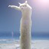
|
Posted: Jul 13, 2010 04:12 PM
Msg. 1 of 20
I thought since this is Halo related i might go ahead and show it with the community.
Heres a nice signiture i made without tutorials  Edited by Etrusion on Jul 13, 2010 at 04:14 PM |
||||
|
|
|||||
|
Invader Veex Joined: Apr 11, 2007 
i make poast |
Posted: Jul 13, 2010 04:29 PM
Msg. 2 of 20
all I see in that is abstract with a couple squiggles and and some text.
|
||||
|
|
|||||
|
Alder250 Joined: Jul 11, 2010 
The last enemy that shall be destroyed is Death. |
Posted: Jul 13, 2010 05:06 PM
Msg. 3 of 20
So you made a sig for a Modacity forum or something?
|
||||
|
|
|||||
|
UnevenElefant5 Joined: May 3, 2008 
its been fun yall, i'll never forget this site :') |
Posted: Jul 13, 2010 05:08 PM
Msg. 4 of 20
Quote: --- Original message by: Invader Veex all I see in that is abstract with a couple squiggles and and some text. There's actually a Spartan in there if you look closely :o But it was a bit overwhelming at first, it took me a while to make sense of what was actually going on in the picture for some reason. |
||||
|
|
|||||
|
Dennis  Joined: Jan 27, 2005 
"We are made of starstuff.� ― Carl Sagan |
Posted: Jul 13, 2010 05:19 PM
Msg. 5 of 20
Image signatures are not allowed in this forum and there is already a Reach discussion thread.
|
||||
|
|
|||||
|
Megaguirus Joined: Feb 26, 2009 
Om nom nom |
Posted: Jul 13, 2010 05:28 PM
Msg. 6 of 20
looks pretty cool
|
||||
|
|
|||||
|
Etrusion Joined: Nov 26, 2008
|
Posted: Jul 13, 2010 06:16 PM
Msg. 7 of 20
Thanks, and sorry Dennis, i was just showing off and seeing if it needed improvement or anything. I won't do it again :]
Edited by Etrusion on Jul 13, 2010 at 06:16 PM |
||||
|
|
|||||
|
Hydrogen Joined: Dec 6, 2009 
Wort Wort Wort... |
Posted: Jul 13, 2010 06:22 PM
Msg. 8 of 20
Quote: --- Original message by: Dennis Image signatures are not allowed in this forum and there is already a Reach discussion thread. why not?? |
||||
|
|
|||||
|
Slayer117 Joined: Oct 3, 2008 
Host of CE3 2010-forever! |
Posted: Jul 13, 2010 06:35 PM
Msg. 9 of 20
Quote: --- Original message by: Hydrogen Quote: --- Original message by: Dennis Image signatures are not allowed in this forum and there is already a Reach discussion thread. why not?? Are you being Serious... "Why Not" ask your self this Why do you think were not allowed to have signatures on this forum, like Rule number 1 is no Profanity. Do you realize how easily it would be for some one to load up some adult images as there signature? to easy. and that would just be to much work on Dennis, and also they take up a lot of useless space. |
||||
|
|
|||||
|
Alder250 Joined: Jul 11, 2010
The last enemy that shall be destroyed is Death. |
Posted: Jul 13, 2010 06:37 PM
Msg. 10 of 20
I have a very terrible time creating such sigs.
|
||||
|
|
|||||
|
Hydrogen Joined: Dec 6, 2009
Wort Wort Wort... |
Posted: Jul 13, 2010 06:48 PM
Msg. 11 of 20
Quote: --- Original message by: Slayer117 Quote: --- Original message by: Hydrogen Quote: --- Original message by: Dennis Image signatures are not allowed in this forum and there is already a Reach discussion thread. why not?? Are you being Serious... "Why Not" ask your self this Why do you think were not allowed to have signatures on this forum, like Rule number 1 is no Profanity. Do you realize how easily it would be for some one to load up some adult images as there signature? to easy. and that would just be to much work on Dennis, and also they take up a lot of useless space. thats true... lol if we did that watch gaigher sign up and all of the sudden well hello O_O |
||||
|
|
|||||
|
Corvette19 Joined: Feb 27, 2007 
|
Posted: Jul 13, 2010 08:40 PM
Msg. 12 of 20
Quote: --- Original message by: Slayer117 Quote: --- Original message by: Hydrogen Quote: --- Original message by: Dennis Image signatures are not allowed in this forum and there is already a Reach discussion thread. why not?? Are you being Serious... "Why Not" ask your self this Why do you think were not allowed to have signatures on this forum, like Rule number 1 is no Profanity. Do you realize how easily it would be for some one to load up some adult images as there signature? to easy. and that would just be to much work on Dennis, and also they take up a lot of useless space. It would be just as easy to delete the profile :/ I could upload "adult images" in the topics as well. |
||||
|
|
|||||
|
abkarch Joined: Mar 20, 2010 
This account is old. Sorry for inappropriate posts |
Posted: Jul 13, 2010 09:39 PM
Msg. 13 of 20
i see overdone gaussan blur text and something that looks like a render of a face.i love the color scheme tho.
|
||||
|
|
|||||
|
Etrusion Joined: Nov 26, 2008
|
Posted: Jul 13, 2010 09:51 PM
Msg. 14 of 20
The render i used is this picture here
 So you can see it a little better |
||||
|
|
|||||
|
Shade117 pro Joined: Jul 2, 2009 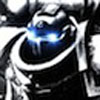
Yeah bro (xfire: blue117pro) I can make cubemaps |
Posted: Jul 14, 2010 02:25 AM
Msg. 15 of 20
Quote: --- Original message by: Etrusion I thought since this is Halo related i might go ahead and show it with the community. Heres a nice signiture i made without tutorials Edited by Etrusion on Jul 13, 2010 at 04:14 PM No, offense... Its not that great. Alot of this is just brushes coupled with image filters to blend and some (not much) masking. The text is too blurry, the wisps around his right arm (in from viewing perspective, left side) stand out and dont blend in. The render (also the majority of the image) seems to be over-sharpened. The focus of the sig (from what's obvious) is the spartan, The sig has evidence of vectoring which is badly used. The wisp doesnt blend in, why? Because you have the majority of the image with sharp edges whilst the wisps dont, same with the text. They dont match the rest of the image. You attempt to blend everything in but with one outstanding error. The render, if you blend the image alot, It would be wise to blend the render aswell. The render doesnt blend in and stands out, also the color blending you have done doesnt help either, it only makes the spartan harder to spot. No Offense, it would've been better if you had followed some tutorials but add your own modifications to them. This is critism, even though i am only pointing out the bad things. I am only showing what needs to be improved next time. Good work though, If you are inexperienced at sig creation, Good work but needs improvement, If you are experienced... Unimpressive. Some of you (im guesssing) will think who am I to criticize this work, In fact I am Thoroughly experienced with sig creation in Photoshop and GIMP, over 3 years experience. But, take these words into consideration and make sure you can try to cover up as much of those flaws next time. |
||||
|
|
|||||
|
Hydrogen Joined: Dec 6, 2009
Wort Wort Wort... |
Posted: Jul 14, 2010 02:26 AM
Msg. 16 of 20
Quote: --- Original message by: Shade117 pro Quote: --- Original message by: Etrusion I thought since this is Halo related i might go ahead and show it with the community. Heres a nice signiture i made without tutorials Edited by Etrusion on Jul 13, 2010 at 04:14 PM No, offense... Its not that great. Alot of this is just brushes coupled with image filters to blend and some (not much) masking. The text is too blurry, the wisps around his right arm (in from viewing perspective, left side) stand out and dont blend in. The render (also the majority of the image) seems to be over-sharpened. The focus of the sig (from what's obvious) is the spartan, The sig has evidence of vectoring which is badly used. The wisp doesnt blend in, why? Because you have the majority of the image with sharp edges whilst the wisps dont, same with the text. They dont match the rest of the image. You attempt to blend everything in but with one outstanding error. The render, if you blend the image alot, It would be wise to blend the render aswell. The render doesnt blend in and stands out, also the color blending you have done doesnt help either, it only makes the spartan harder to spot. No Offense, it would've been better if you had followed some tutorials but add your own modifications to them. This is critism, even though i am only pointing out the bad things. I am only showing what needs to be improved next time. Good work though, If you are inexperienced at sig creation, Good work but needs improvement, If you are experienced... Unimpressive. Some of you (im guesssing) will think who am I to criticize this work, In fact I am Thoroughly experienced with sig creation in Photoshop and GIMP, over 3 years experience. But, take these words into consideration and make sure you can try to cover up as much of those flaws next time. the letters are to blurry but i can read um it says jake - 474 |
||||
|
|
|||||
|
Shade117 pro Joined: Jul 2, 2009
Yeah bro (xfire: blue117pro) I can make cubemaps |
Posted: Jul 14, 2010 06:32 AM
Msg. 17 of 20
Quote: --- Original message by: Hydrogen the letters are to blurry but i can read um it says jake - 474 It Does also, i made this just then, it took me about probably 5-8mins No tutorials, just hot right off the pan. 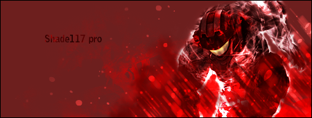 This sig is simple but effective. It Blends and it isnt cluttered and has vectors that draw you to the well Blended yet easy to see spartan. The text is easy to see and matches the sig and compliments it. The smudges at the bottom give a stronger effect that of when the spartan has his fist in the ground. The Visor is a different color so that the image isnt bland in color and has atleast some color variation. Try and evaluate this and use this information to your advantage. EDIT: the spartan visor is custom made. lol, thats why it looks different from the stock image/Render Edited by Shade117 pro on Jul 14, 2010 at 06:34 AM |
||||
|
|
|||||
|
Etrusion Joined: Nov 26, 2008
|
Posted: Jul 14, 2010 01:01 PM
Msg. 18 of 20
Most the stuff i did in the signature was just brushes, the render, and some editing of brightness and contrast, i didn't sharpen anything. And the reason it has a lot is because i like having a lot of stuff to look at in my signatures, i mean the text is blurry understandable, but i did that because it looked better than the other tries i had for text. So yeah, that's for the notes above, they will be helpful and some point, when i actually use most the stuff you listed above haha
|
||||
|
|
|||||
|
Dennis Joined: Jan 27, 2005
"We are made of starstuff.� ― Carl Sagan |
Posted: Jul 14, 2010 04:46 PM
Msg. 19 of 20
Quote: --- Original message by: Etrusion I am not disallowing the topic as long as it stays Halo related and is not abused. I was just stating that you can't use image signatures in this forum and there can't be more than 3 Reach (halo 2 or 3) discussions on the home page.Thanks, and sorry Dennis, i was just showing off and seeing if it needed improvement or anything. I won't do it again :] |
||||
|
|
|||||
|
Shade117 pro Joined: Jul 2, 2009
Yeah bro (xfire: blue117pro) I can make cubemaps |
Posted: Jul 14, 2010 08:47 PM
Msg. 20 of 20
Quote: --- Original message by: Etrusion Most the stuff i did in the signature was just brushes, the render, and some editing of brightness and contrast, i didn't sharpen anything. And the reason it has a lot is because i like having a lot of stuff to look at in my signatures, i mean the text is blurry understandable, but i did that because it looked better than the other tries i had for text. So yeah, that's for the notes above, they will be helpful and some point, when i actually use most the stuff you listed above haha well, if then, be careful of what brushes you use and contrasting can cause some objects to get sharper. But yeah, its alright anyways... Your style is alot more different from the types of styles i do (trust me, i do alot) thats why i see alot of flaws in my perspective, If its good inn your eyes, and think the community (majority) would like it, then go ahead, It oughta be great. |
||||
|
|
|||||

|